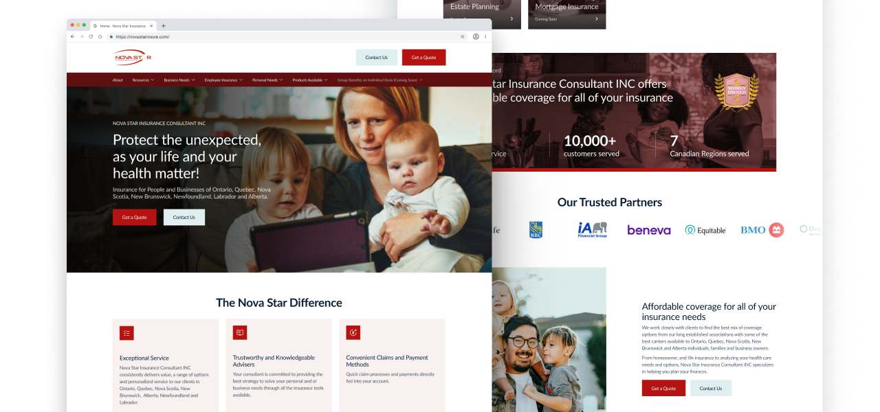
As Nova Star expanded its services, their website struggled to keep up — with low impressions and no conversions. I led the website redesign, focusing on crafting a seamless user experience paired with a visual language that reinforces Nova Star’s trusted reputation.
Why was the website performing so poorly?
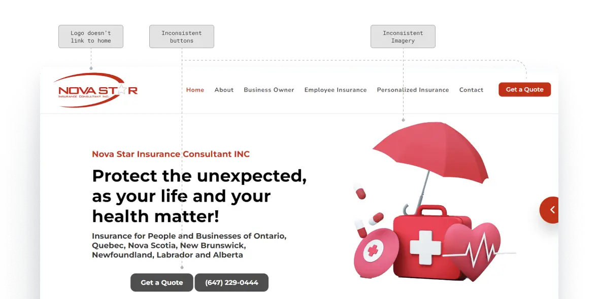
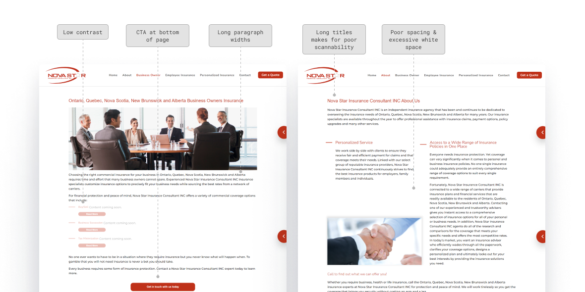
A poor interface created a clunky and awkward user experience, with many inconsistencies and accessibility issues across the website. The interface was poorly designed and most likely have had a negative affect on the impression it gave to users.
The Problem
Poor design principles and a clunky navigation made for a poor user experience.
Issue 01
Inconsistency in components, such as buttons, across the website.
Issue 02
Accessibility issues with colour and contrast, as well as hover and active states for buttons/links.
Issue 03
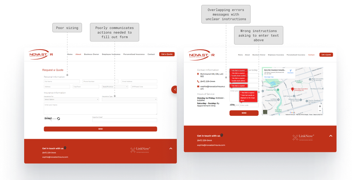
Forms poorly communicate actions user need to take and use technical jargon for errors.
How might we...
…help users who are often confused about choosing insurance, easily find and choose the right plan that fit their needs?
…design a website that will help increase Nova Stars impressions and conversions while aligning with their brand and reputation?
Explorations
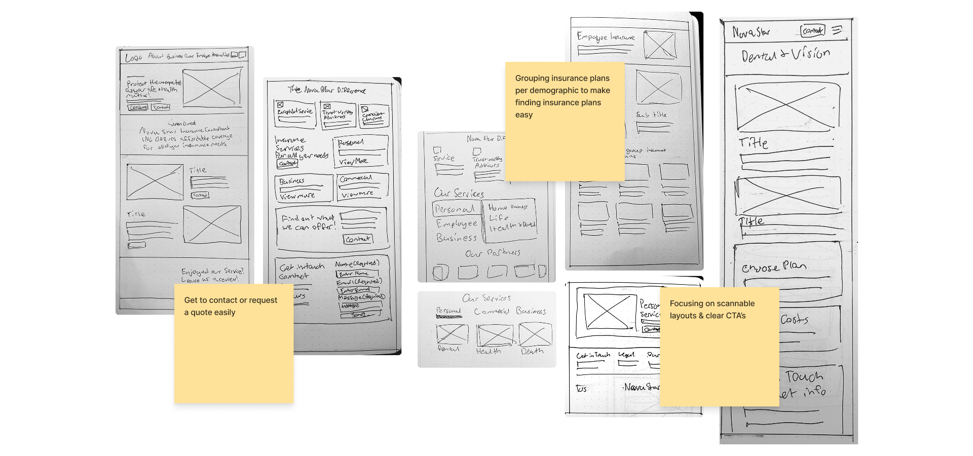
During sketches and explorations I focused on helping users find the right insurance plan more efficiently, making it easy to get in contact with a Nova Star agent, making pages scannable, and showcasing Nova Star’s reputation to help sell their services.
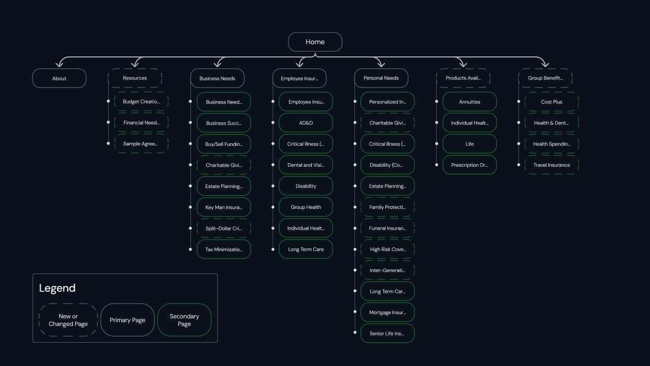
A clearer navigation
The sitemap was redesigned to organize pages alphabetically, which would help users find the insurance they’re looking for easier, especially with the longer lists. The client was providing new content for new pages, so those were added, as well as some copy changes to titles to provide a clearer label such as ‘Business Owner’ becoming ‘Business Needs’.
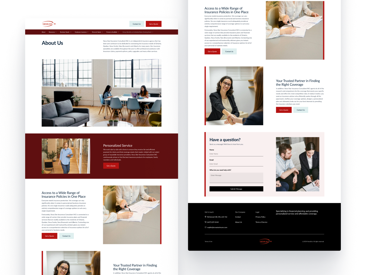
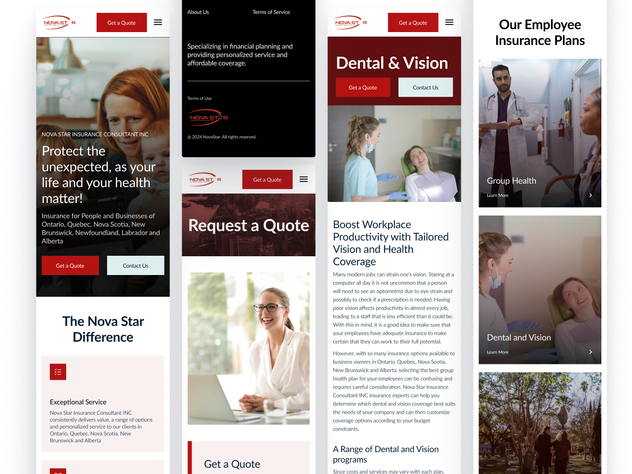
A visual design that aligns with Nova Star’s brand and reputation.
An easier way to find the insurance plans that you need.
I categorized the insurance plans according to different needs: individual, business, for employees, etc. I also moved up insurance plans higher on important pages such as the home and overview pages, so that users don’t have to spend a lot of time looking for what they need.
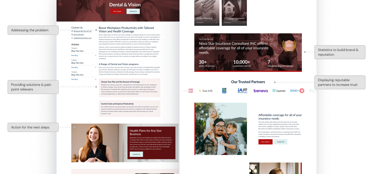
A layout for better conversions.
I intentionally created layouts to help build Nova Star’s reputation and provide solutions to user’s pain points. Different points of contacts are easily accessed by the user to make contacting and requesting a quote quick and simple.
Reflection
What I learned
Adjusting my process to fit constraints
This project gave me the challenge of constrained resources, such as lack of research and testing. I learned how to adjust my process and manage resources to work within the constraints while still creating quality outcomes.
What I would do next time
Take more time in the planning stage
Planning out resources I could use and looking ahead would help me save time in the long run. For example, getting familiar with the web builder (Elementor) we used before the design phase would have helped me to design with it’s capabilities in mind.
What’s next
Tracking and Adjustments
Monitoring the website’s performance and making adjustments to content, strategy, and A/B testing sections to help improve impressions and retention times.