Reduced the amount of time to find contact information for a service.
63.79% (+15.6%)
Increased Engagement Rate
36.2% (-14.1%)
Decreased bounce rate.
Overview
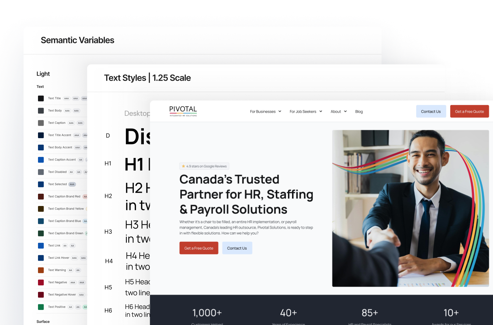
At Pivotal I led the redesign of our company website. My responsibilities included creating a design system, user experience overhaul, and the development of the site.
Part of the work I spent on Pivotal’s website included redesigning the user experience for businesses with the goal to increase conversions as conversions were low and the bounce rate was high.
I redesigned the interfaces and paths for businesses to make the experience more efficient which has led to a higher conversion rate and a lower bounce rate.
Businesses were having difficulty contacting us – this was evident in the forms, which either had low impressions or were not converting as expected.
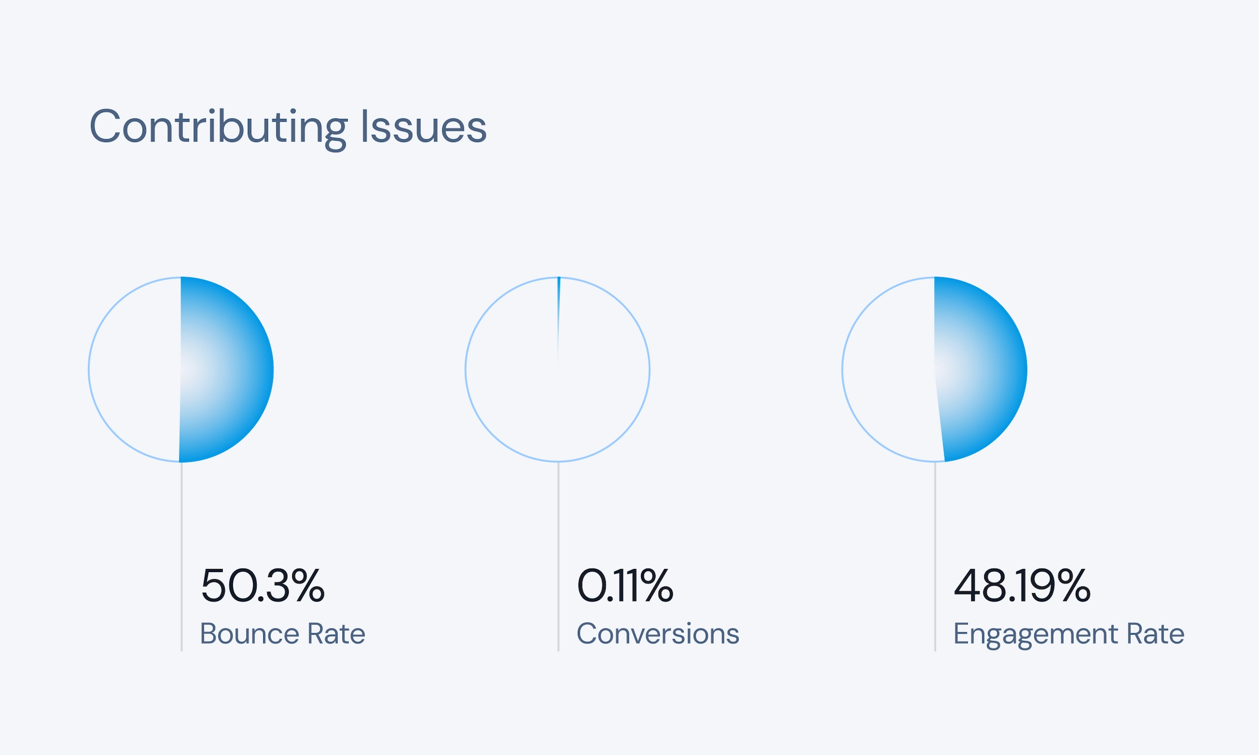
The overall conversion rate for the forms was 0.11%, and the Request a Quote form only had 1-2 submissions a month. Data also showed that users were not engaged, reflected in our 50.3% bounce rate and 35s average engagement time.
The Problem
Confusing messaging and high friction paths caused low conversions and a high bounce rate.
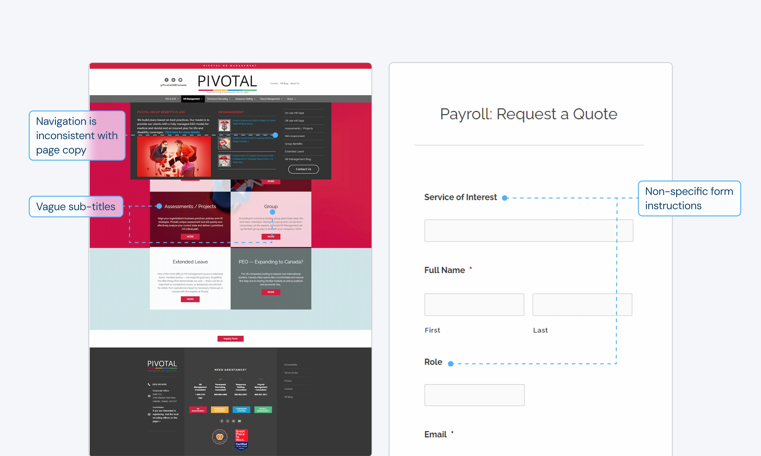
User testing and an in-depth analysis revealed that Pivotal’s website was struggling to convert business users because it created friction at nearly every stage of the user journey. Below are the key insights that made it difficult for users to understand the value Pivotal provides and lost conversions.
insight 01
Vague copy confuses users
Testing found that vague navigation labels and titles made users confused. On forms, users were filling poorly labelled fields with the wrong information.
insight 02
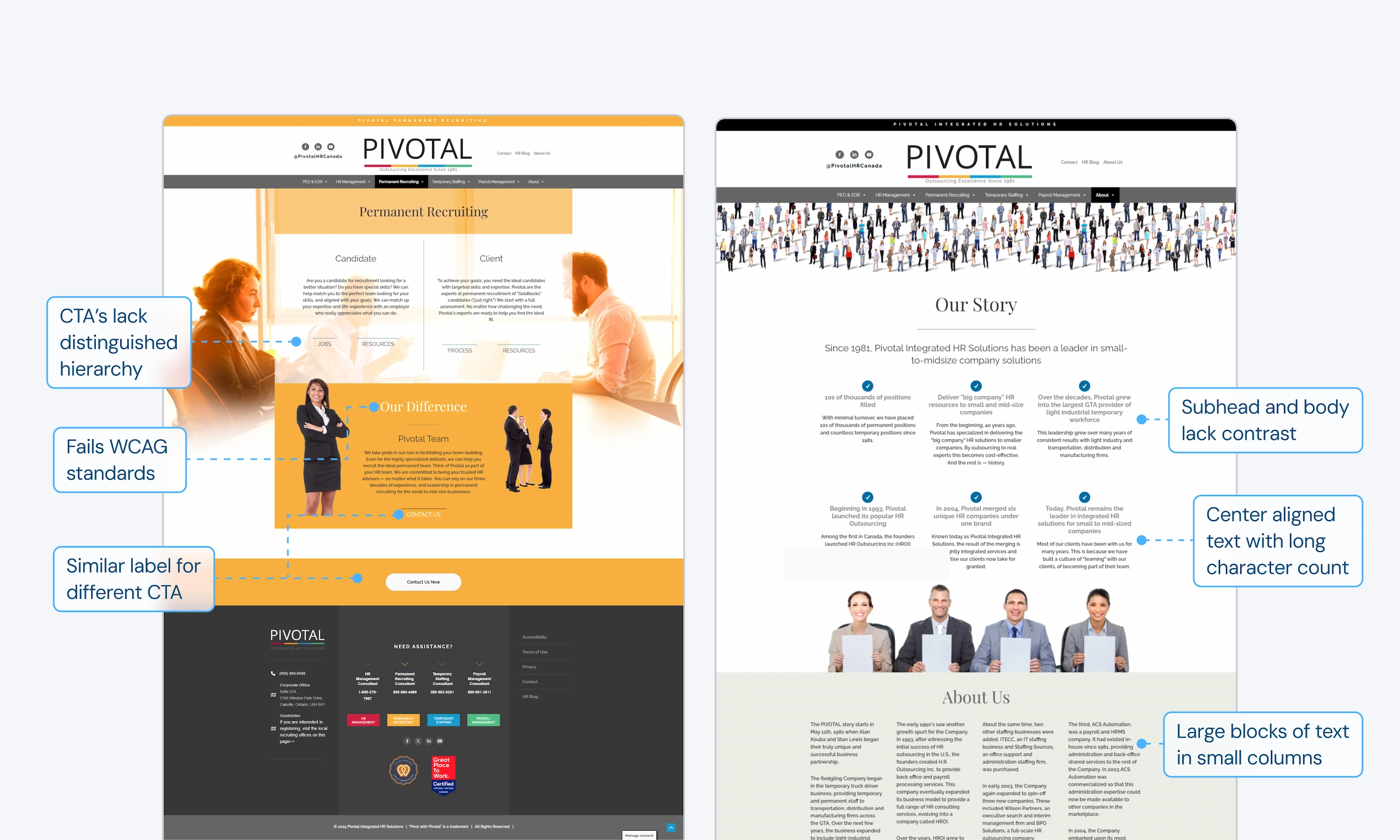
Inconsistent and busy interfaces make finding information difficult
Testing showed that a lack of hierarchy, busy interfaces, and difficult to scan layouts make it difficult to quickly find information and complete tasks.
insight 03
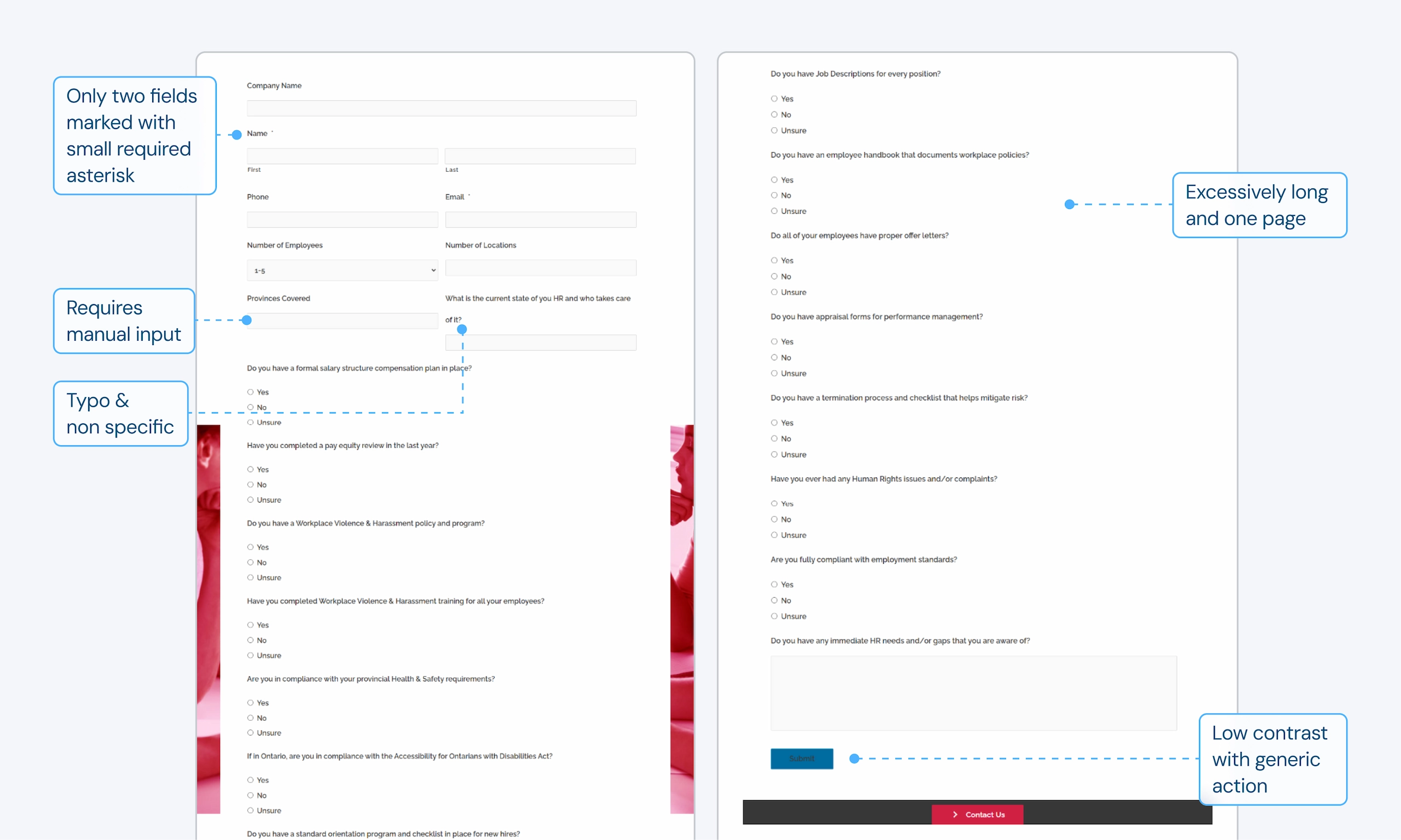
Complicated and long forms prevented users from wanting to fill them out
Longer forms were performing very poorly, such as the Request a Quote or previously used Mini Assessment.
insight 04
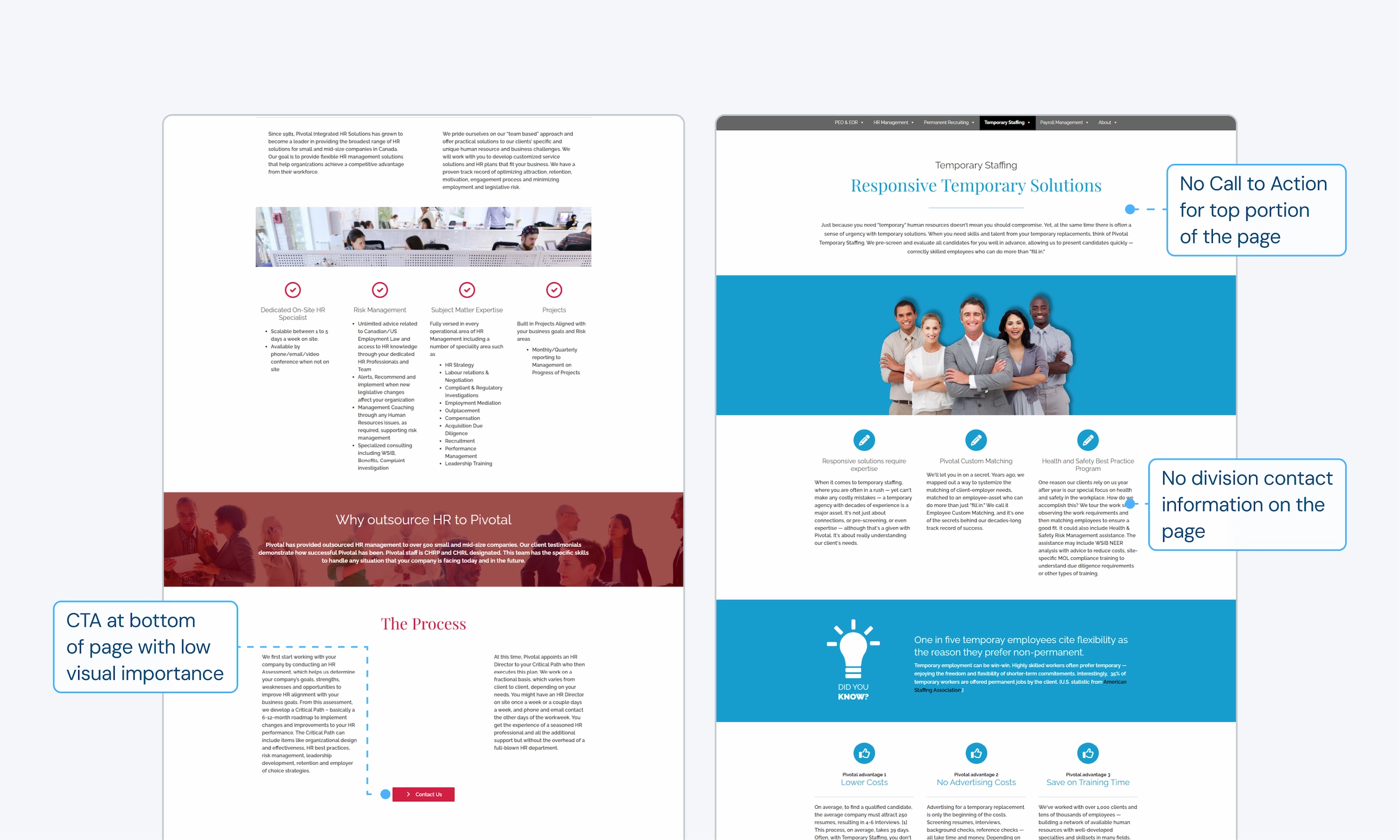
Lack of access points made it difficult to find out how to get into contact
Testing showed that users had a very difficult time finding contact information for specific departments. Data shows the forms with low amounts of internal links were correlating to low impressions.
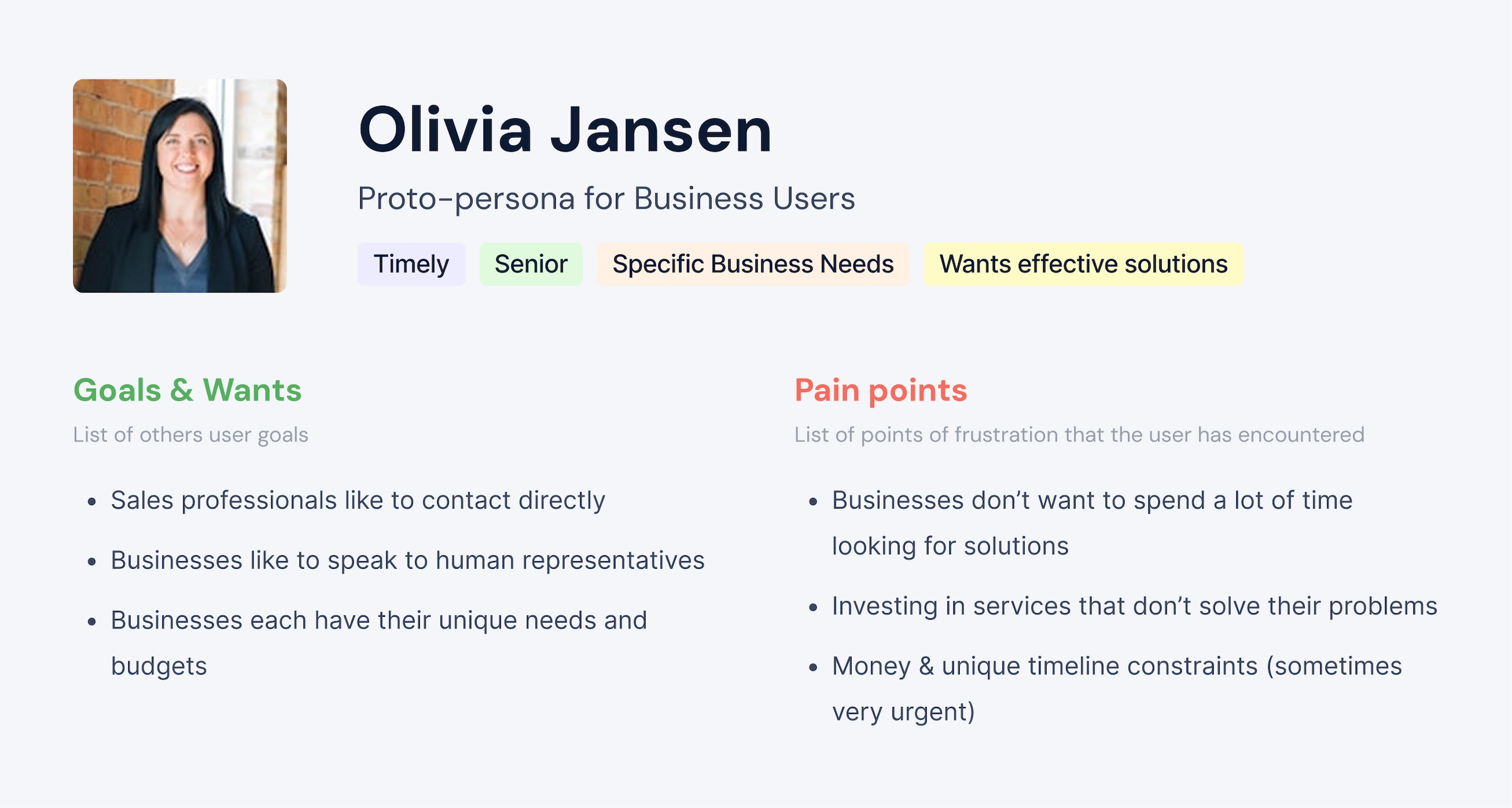
Understanding our users
Learning from consulting with our own internal sales and marketing team, I highlighted some key insights for traits that our business users have and created a simple proto-persona to guide my design decisions.
Utilizing our positioning
I wanted to highlight Pivotal’s unique value in the design and content. A competitive analysis revealed these key insights to stand out among competitors:
insight 01
Largest & Most Reputable Leader for Canadian SMBs
Pivotal’s a leader in HR services for Canadian SMBs. Competitors are targeted at enterprises, small businesses, or not aimed at the Canadian market.
insight 02
Trustworthy reputation
Pivotal has the reputation and accolades to prove their services are trustworthy, as shown in testimonials, awards, and long standing partnerships.
insight 03
Long standing company
Pivotal has been in business since 1981 and has a large number of experienced staff.
Business Goals & Opportunities
I helped to establish goals and opportunities that the redesign aims to accomplish.
Reduce Bounce Rate
Current
50.3%
Target
40% long term
Increase Conversions
Current
0.11%
Target
4%+ long term
Increase Engagement
Current
48.19%
Target
55% long term
How might we help businesses who are looking for effective HR solutions easily find information for our services and contact Pivotal?
Explorations 01
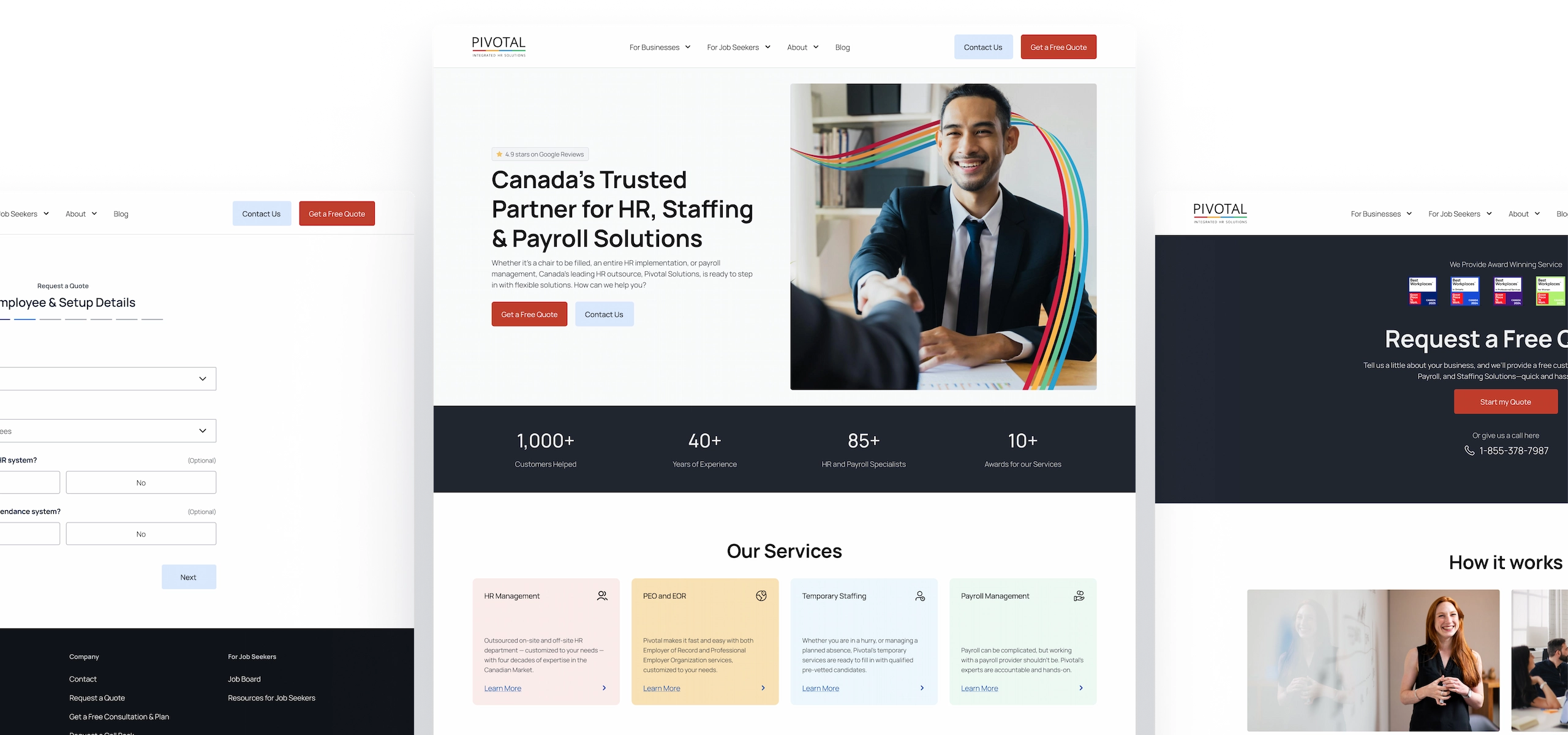
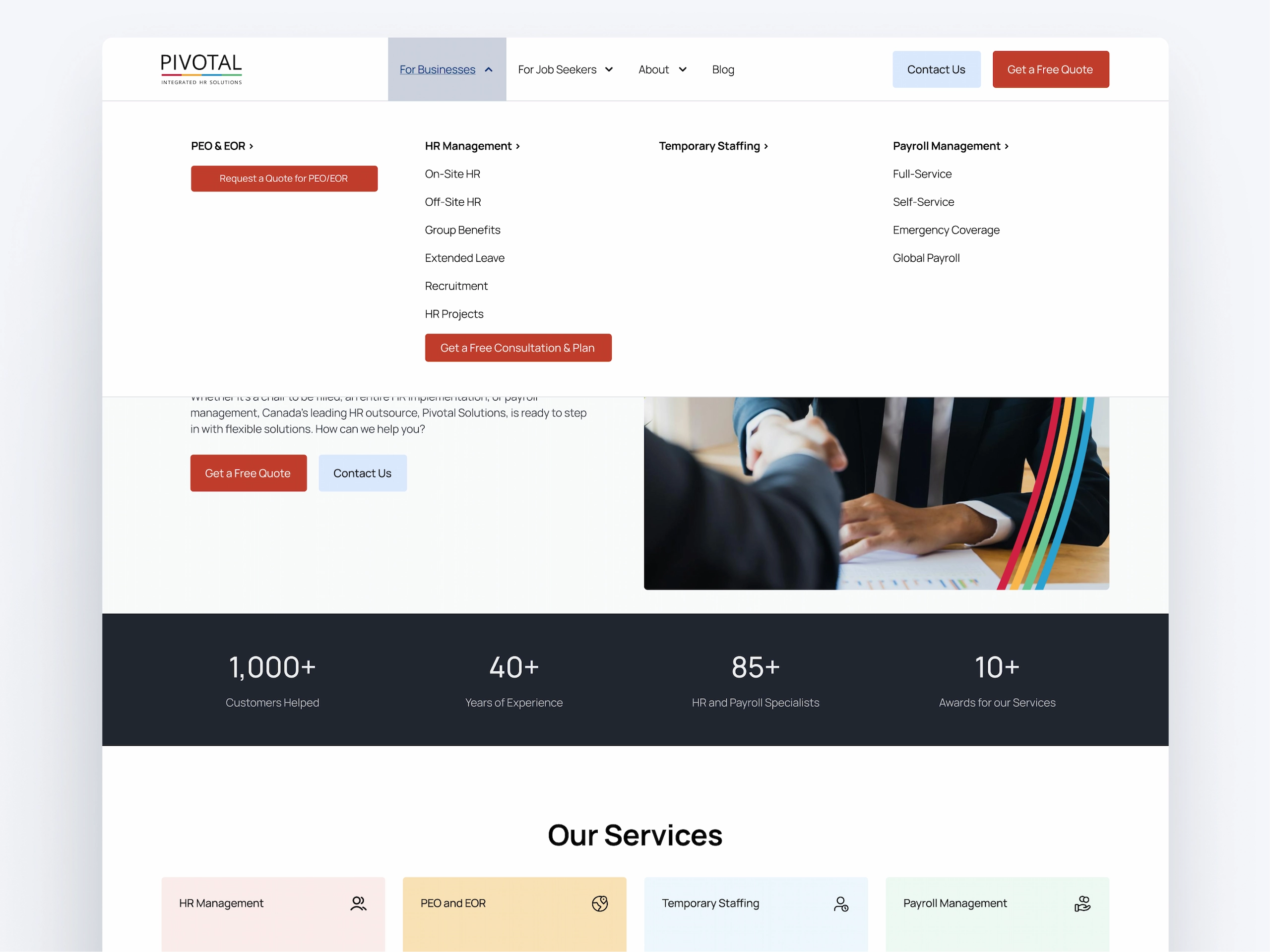
Redesigning the interface to make completing tasks easier
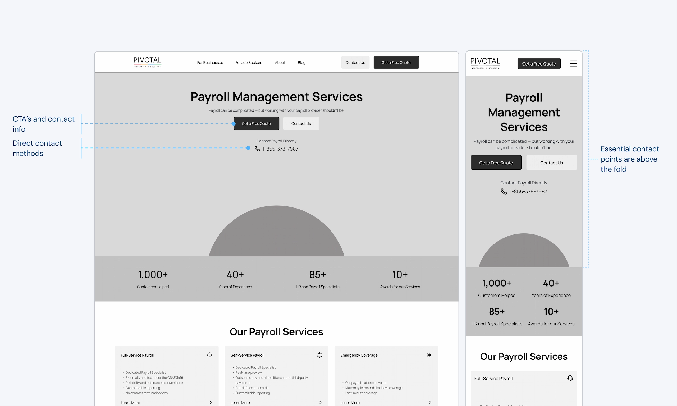
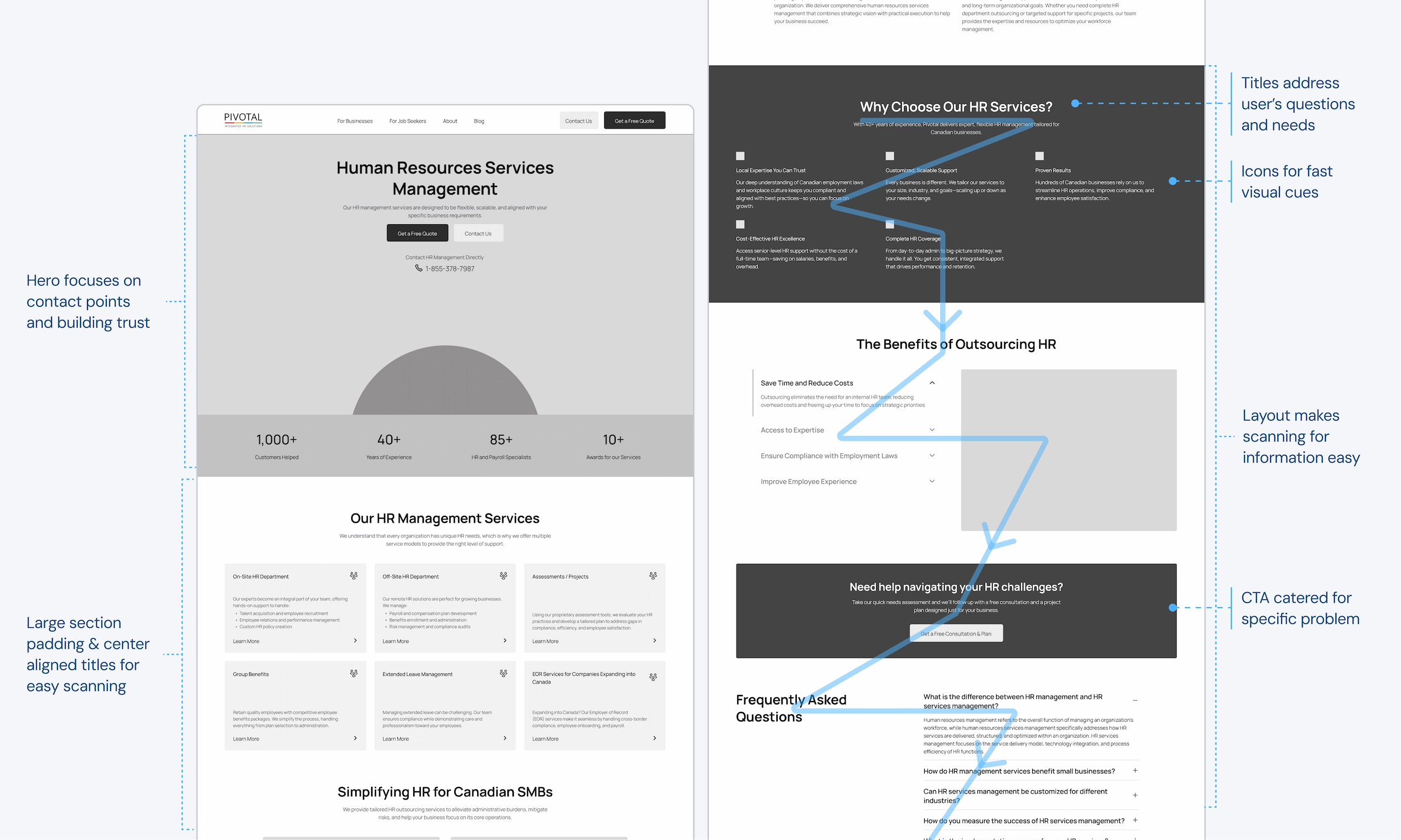
Layouts were designed to reduce interaction costs so that completing desired tasks is easier. This includes creating contact points above the fold, using clear labels/titles, and creating layouts designed for scanning.
01.1
01.1
Placing CTA’s and contact info above the fold to be easily accessed.
01.2
01.2
Layouts & copy designed for scanning and completing tasks fast.
01.3
01.3
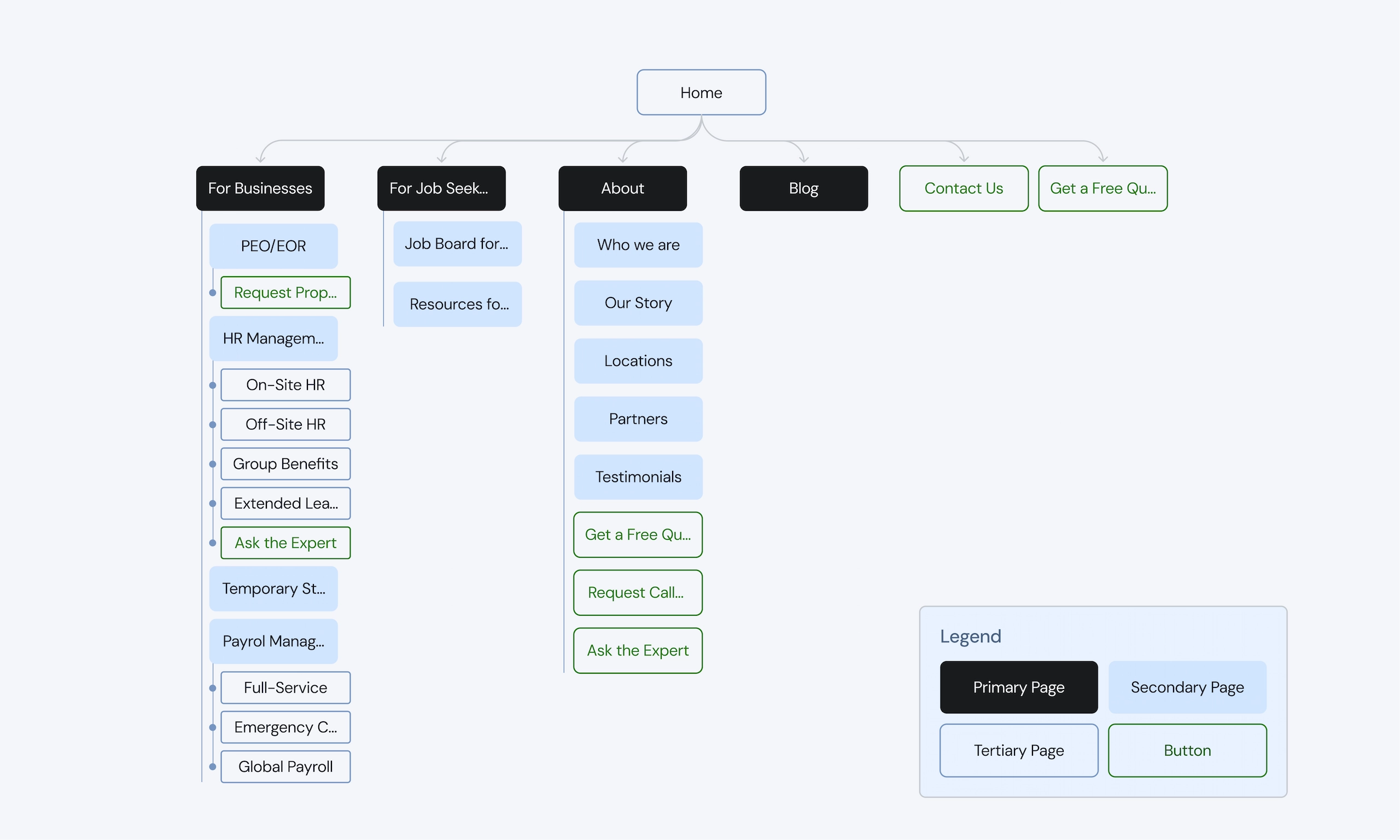
Navigation groups all service pages in one place for businesses and keeps key CTA’s always in view.
Explorations 02
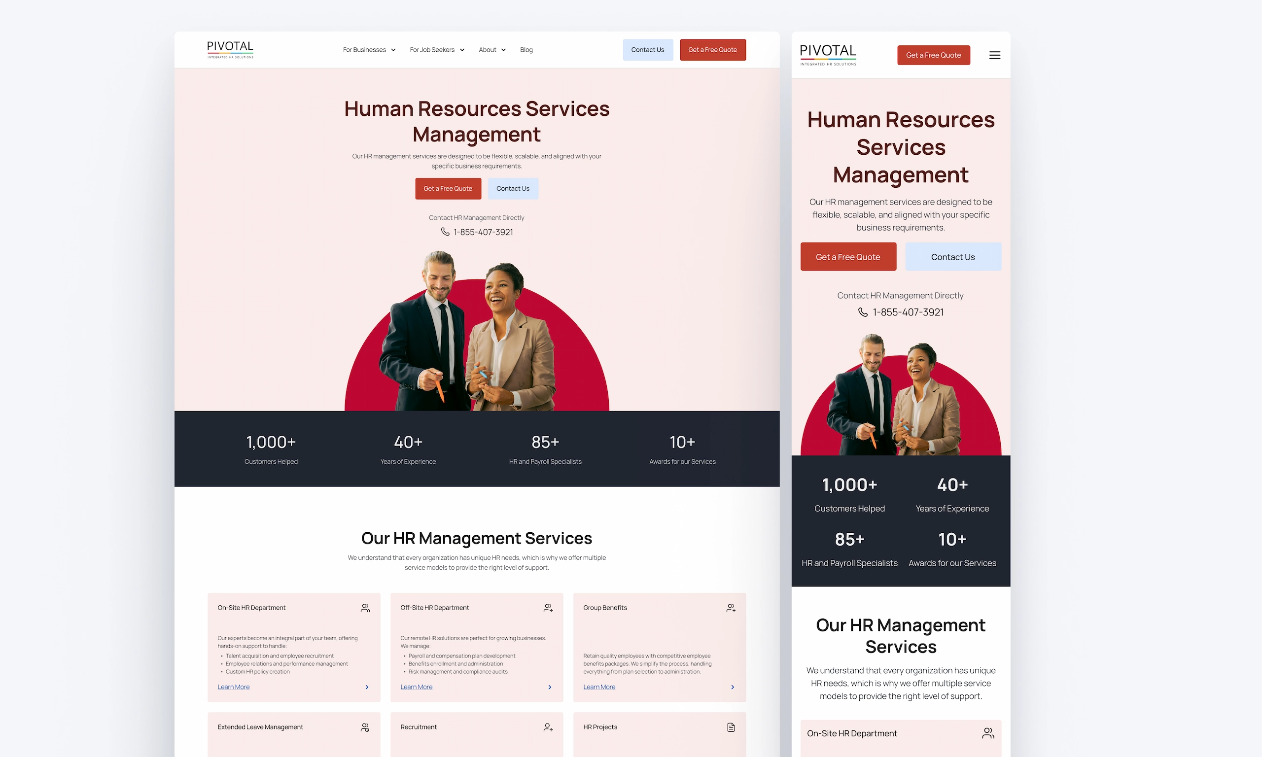
Building confidence & trust to reduce friction
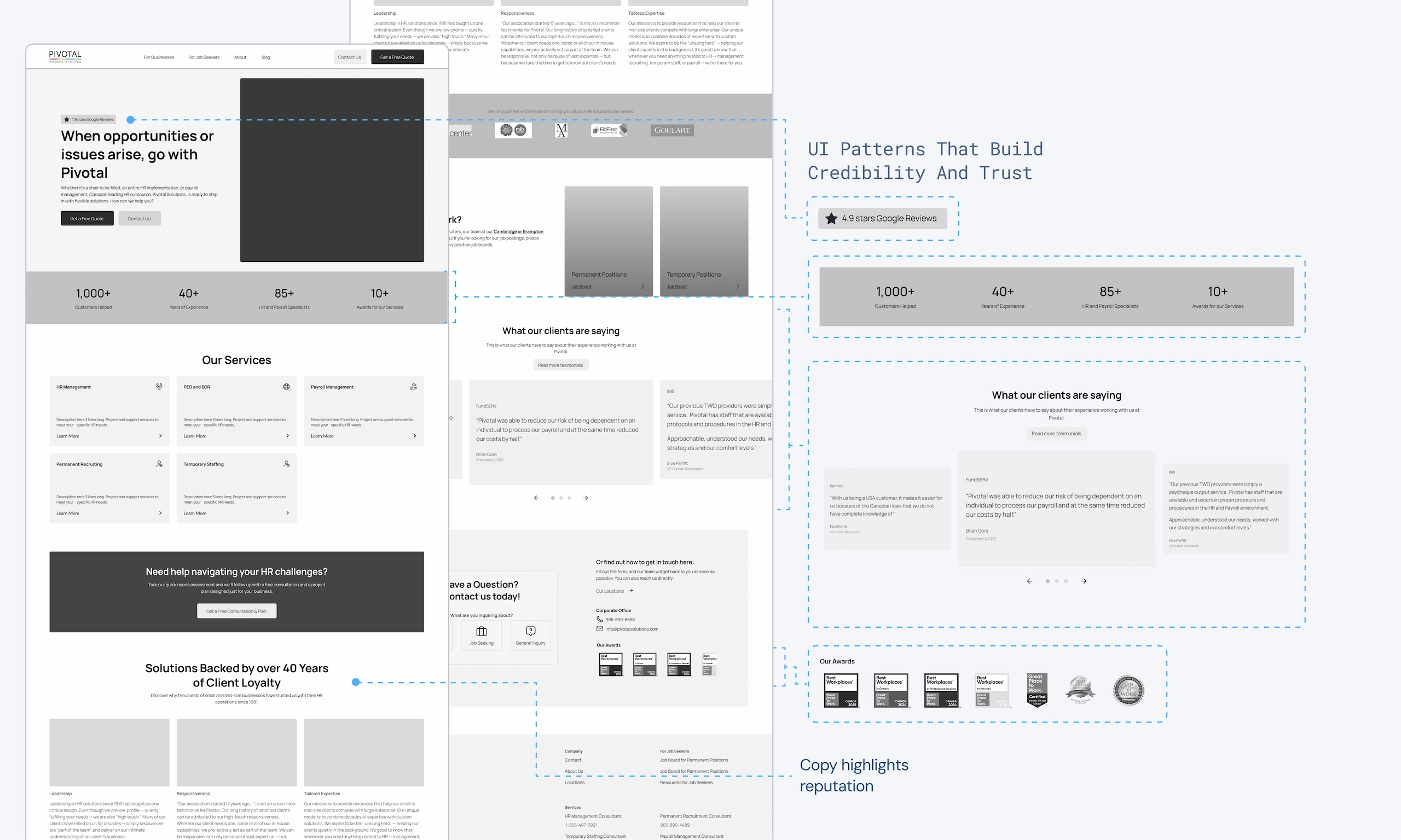
By highlighting Pivotal’s unique selling points through UI patterns, imagery, and copy, Pivotal could underline it’s reputation and build confidence in it’s users.
02.1
02.1
Using imagery and UI patterns that build credibility and trust. Copy and titles were rewritten to highlight Pivotal’s accolades and expertise.
Explorations 03
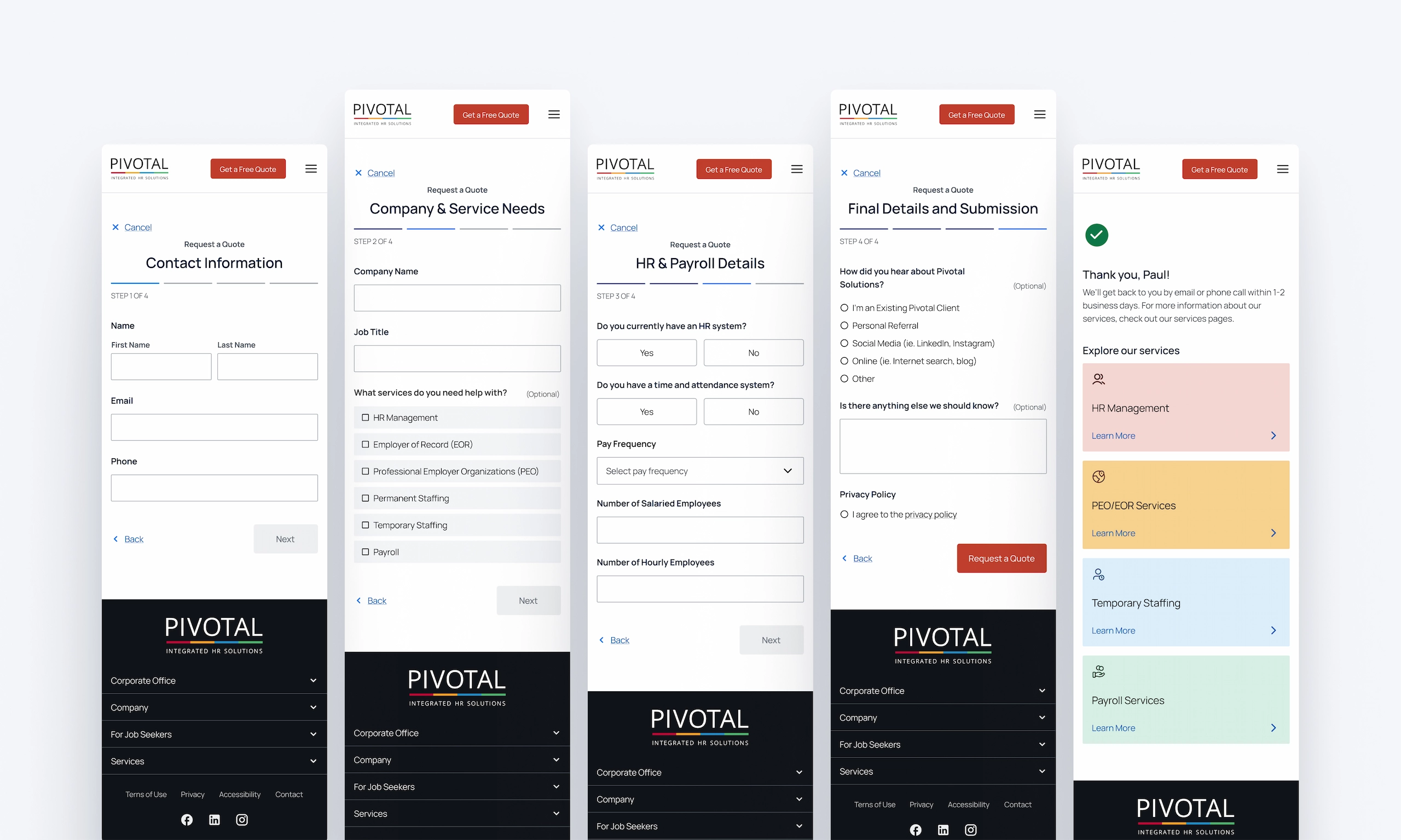
Making forms easier to fill out to increase conversions.
Many forms were performing poorly with extremely low conversion rates – some being 0%. I redesigned the forms to reduce cognitive load and make filling out forms a simple and easy process. Forms that weren’t necessary were removed, while others that were doing the same job were combined.
03.1
03.1
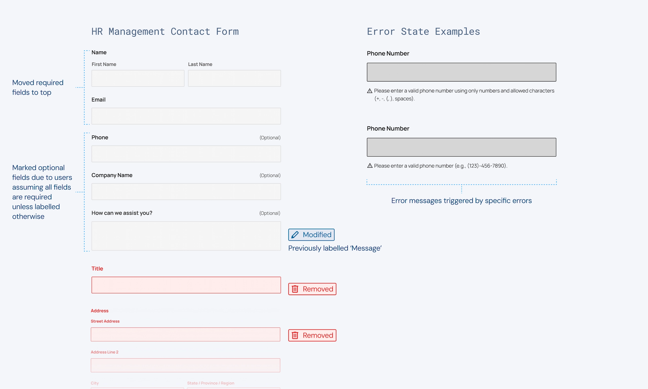
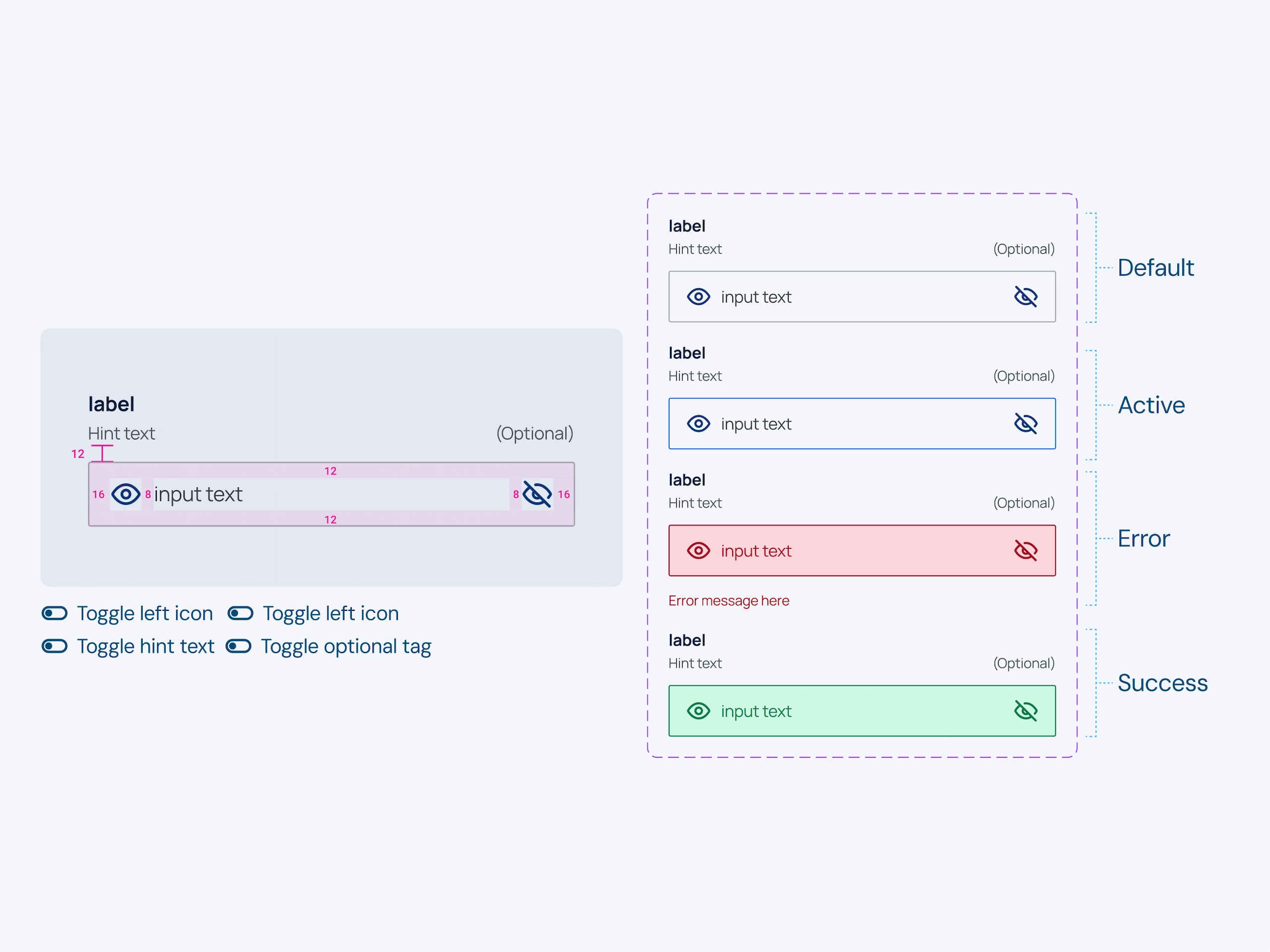
Forms were redesigned to remove unnecessary fields that weren’t being filled out & provide clearer labels and error messages to help the user.
03.2
03.2
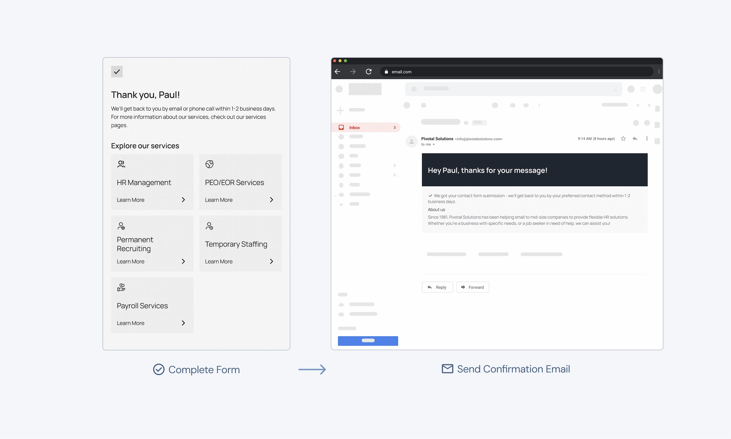
Providing clear and specific confirmation messages both on screen and to the user’s email.
03.3
03.3
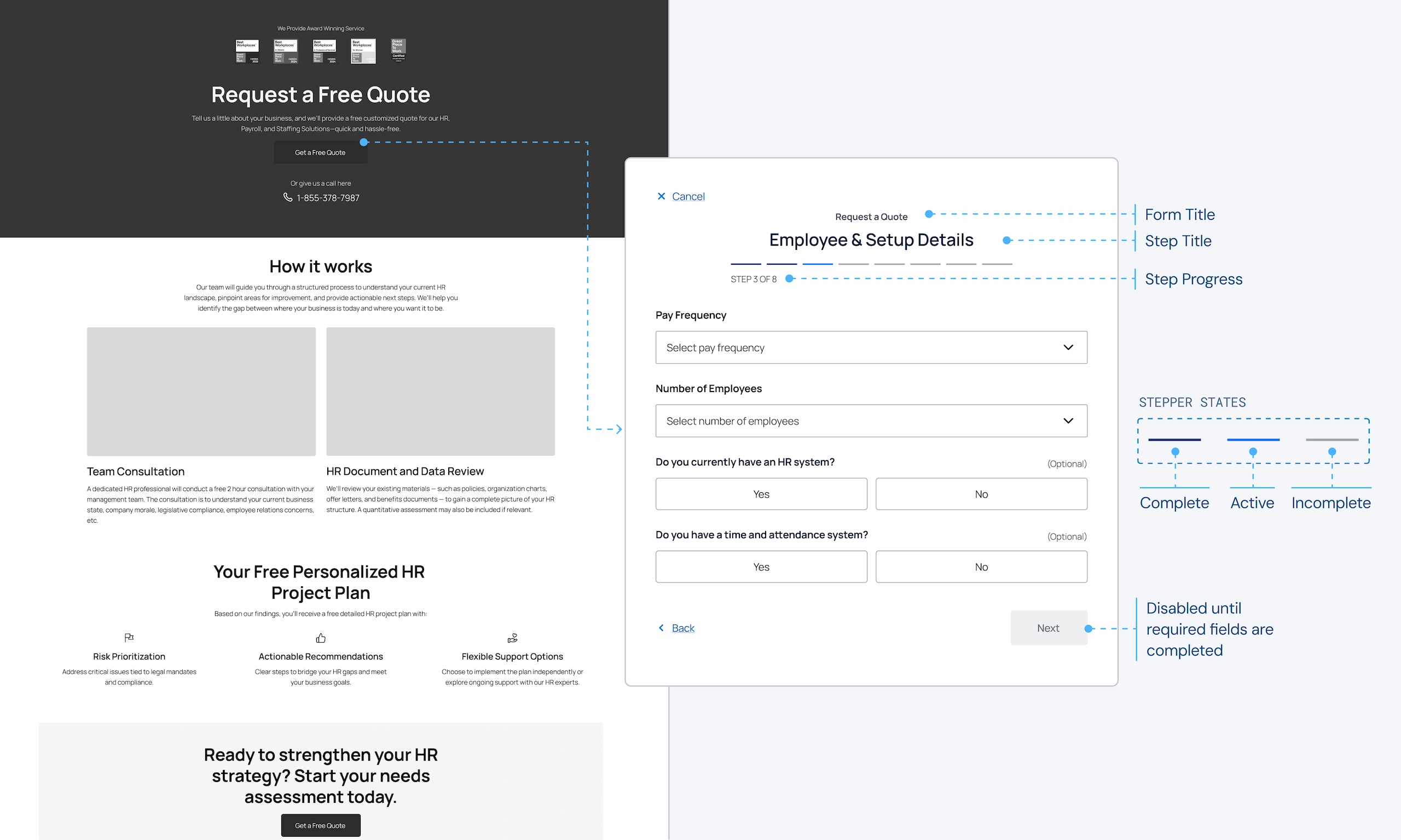
Longer forms are broken up for progressive disclosure by using a context screen and multiple steps.
Final Designs
Redesigned to make getting in contact and finding assistance easy.
The redesign makes getting in contact easier by optimizing layouts, reducing interaction costs, and through intuitive form experiences. The redesign builds trust with users and makes it easy for them to find the information they need.
Reflection
Establishing early goals & principles helps large designs fall into place.
This project has been the largest and longest I’ve worked on a project. I learned that having key goals and principles to guide the design decisions throughout the project really helped the whole project work together harmoniously.
Utilize the data available to you.
I learned that using data from different sources has been extremely helpful to inform my design decisions. Utilizing polls from our social media, sifting through form submissions, gathering data from GA4 or getting spoken insights from our team who interact with clients on a daily basis helped form a great basis for the research of the project.