AQUANURE
Role
UI/UX Designer
Team
2 UI/UX Designers
2 User Researchers
1 Interaction designer
Timeline
3 months
Tools
Figma, Figjam, Otter.ai, Slack, Zoom, Trello
UI/UX Designer
Team
2 UI/UX Designers
2 User Researchers
1 Interaction designer
Timeline
3 months
Tools
Figma, Figjam, Otter.ai, Slack, Zoom, Trello
Overview
Aquanure is a retailer that sells premium organic plant growers. Their original website was initially created for the purpose of educating customers about Aquanure products and eventually they started selling products online but weren’t seeing the success they had in stores.
The goal of the project was to increase visitor retention rates and decrease bounce rates by redesigning their website. I played a pivotal role in establishing business objectives with the stakeholder, proposing design strategies, and the overall redesign of the website.
The problem
Fish manure is an unconventional way to help grow your plants organically. Despite this, Aquanure is sold in stores across Ontario and has found success as a premium organic and environmentally friendly plant grower. Where they struggled was with their online presence and sales.
When approached by one of the stakeholders and owners of Aquanure, he explained how the website was initially created to educate customers on how Aquanure products worked and eventually tried to start selling online. He expressed a need for a redesign that aligns with Aquanure’s identity and increase user retention rates and conversions.
The Solution
An e-commerce platform that is easy to navigate and use, making the shopping and learning experience delightful and easy.


Results
-12.7%
︎︎︎ bounce rate
+1 min 12s
︎︎︎ average session duration
The redesign was also met with positive feedback from customers when launched before trade show.
*Statistics as of March 25, 2024
My Process

Research
What issues does the current site have?
Out with the old
Before starting to think of new ideas for the redesign, I needed to discover the issues with the current site. Both a heuristic analysis and user tests were conducted to get a thorough understanding of the original state of the website. 5 user tests were conducted with gardeners and plant enthusiasts.
The following are the major issues found:
The following are the major issues found:
- Extremely low contrast
-
Cluttered and busy layout that made it difficult & confusing to navigate
- Inconsistent use of design elements


UX/UI Audit
Through the analysis, I found that the website had lots of room for improvement. The website lacked basic design principles and suffered greatly from this, with users saying that the website often felt cluttered and confusing.
During user tests, most users would often not know where to go and ultimately could not successfully go through the checkout.
During user tests, most users would often not know where to go and ultimately could not successfully go through the checkout.

User interviews
How do plant lovers shop?
The next step to understanding how I can create a curated experience for plant lovers is to understand them.
5 user interviews were conducted with the same users that participated during user testing (including my local plant expert, my Mom) to understand their plant shopping habits, how they take care of their plants, and how they get their plant info.
5 user interviews were conducted with the same users that participated during user testing (including my local plant expert, my Mom) to understand their plant shopping habits, how they take care of their plants, and how they get their plant info.

Main insights
Using affinity mapping, these key insights were found from the interviews…
- Gardeners educate themselves online, typically through social media or forums
-
Gardeners usually prefer organic/natural products and don’t like herbicides
-
Plants are typically cared for everyday and/or weekly
- Products that are used often are used because of their convenience and results
User Persona
Meet Christa
Using these insights from the interviews, a persona named Christa was created. By empathizing with Christa I’m able to get in the users shoes and consider her needs, wants, pain points, and goals.
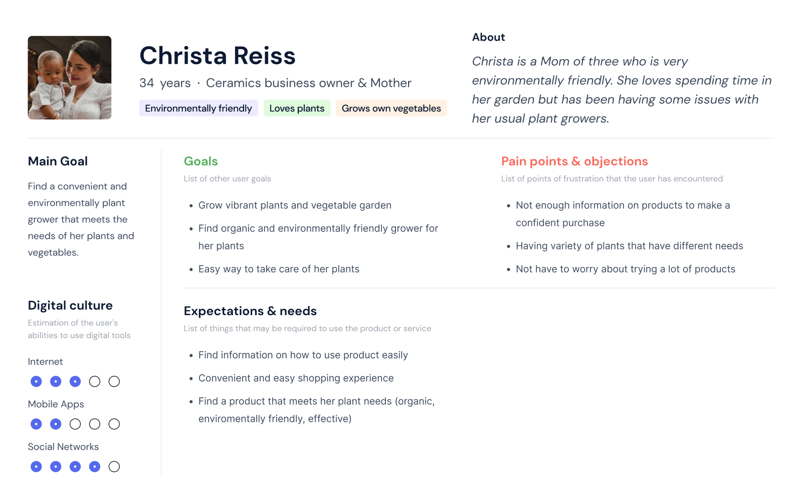
Considering Christa’s need to find an effective and environmentally friendly option for her plants…
🤔
How might we improve Aquanure’s user experience and interface to improve user engagement and give customers, like Christa, a smooth shopping and learning experience?
Competitors
Industry rivals fall short of implementing fundamental design principles, resulting in cumbersome interfaces and poor user experiences.

Opportunity
Through a comprehensive competitor analysis, it was clear there was an opportunity to deliver on an online shopping experience that was convenient and easy.
Scope
The total scope of the project includes designing the following responsive pages for desktop and mobile;
- Home page
- Store locator page
- FAQ page
- Contact page
- Education page
- Shop now page
- View cart page
- Checkout page
- Thank you page
Constraints
Along with a defined scope came some constraints we had to consider.
- Working around Wix Studio’s integrated e-commerce functionality which was unchangeable in terms of the flow
- Lack of resources for photography and developers
Business Objectives
I led a meeting with the stakeholder to define some objectives we wanted to aim for in terms of metrics to measure the success of the redesign. Since the main purpose of the redesign is to help increase customer retention to help increase online sales we landed on these two objectives…
︎
Decreasing bounce rate by 10-20%
Business Objective
From original bounce rate of 64.3%.
Business Objective
From original bounce rate of 64.3%.
︎ Increasing retention time by 20-30%
Business ObjectiveFrom the original retention time of 6 minutes per session.
Design Principles
From this point, I proposed to our team to establish design principles to guide our design decisions, keeping consistency in quality and how we design the website. We landed on these three core principles.
︎ Ease of use
Make things easy for the user.︎ Provide Guidance
Assist the user whenever we can.︎ Create a quality experience
Interacting with the website should feel smooth.
Ideation
Optimizing the shopping experience.
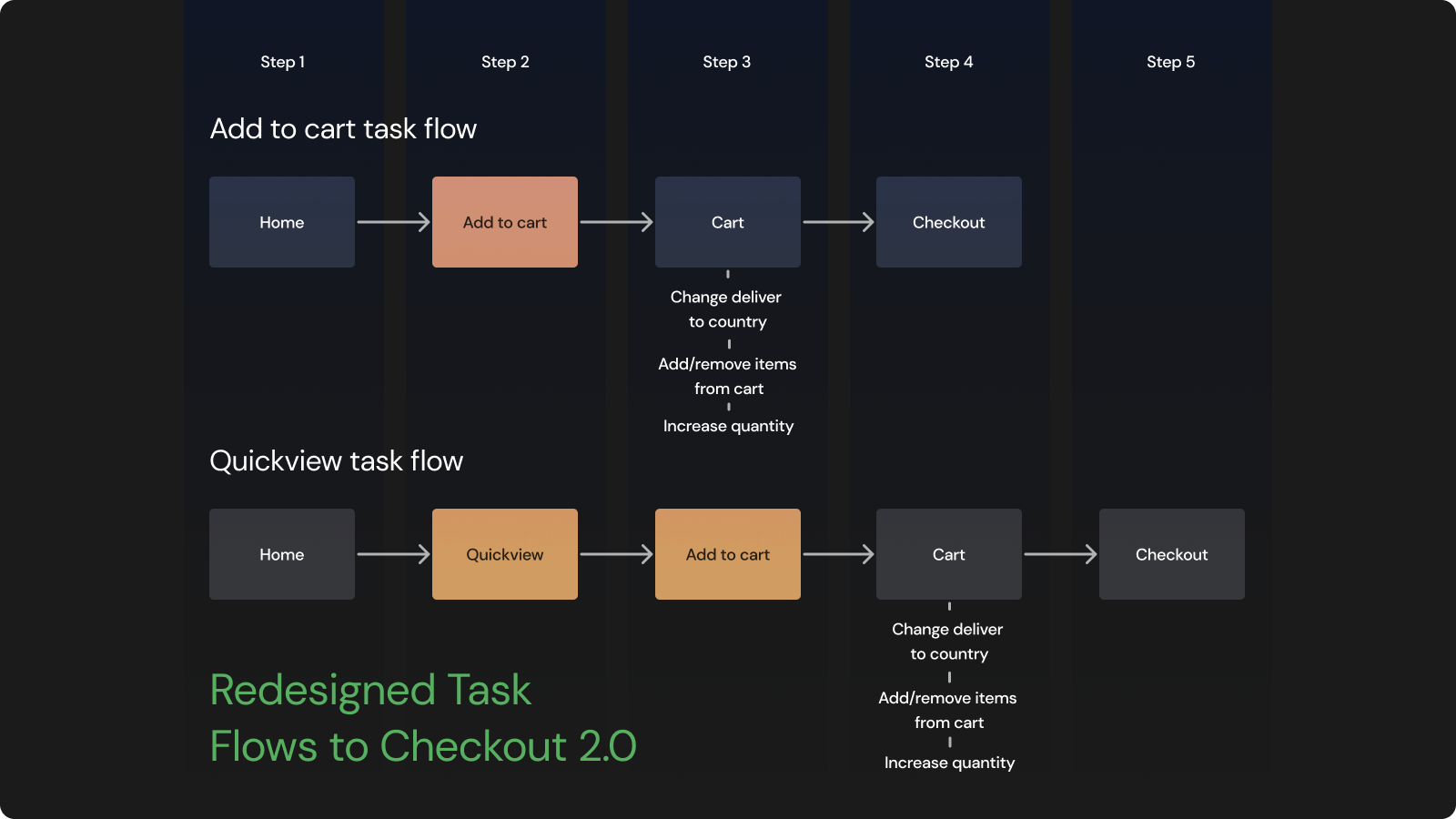
Task flows
Knowing I couldn’t change the flow of the checkout process because of Wix’s integrated checkout process, I wanted to give Christa a way to shop quicker and easier.
I began generating ideas starting with how I can optimize the shopping experience, starting from task flows.
The main idea was to use Wix’s ‘ buy now ’ and ‘view product’ buttons where products are displayed so that customers can easily get to the checkout process.
I began generating ideas starting with how I can optimize the shopping experience, starting from task flows.
The main idea was to use Wix’s ‘ buy now ’ and ‘view product’ buttons where products are displayed so that customers can easily get to the checkout process.


Compared to the six step process to get to the checkout - Christa could either directly view then add an item to her cart, or if she knows she wants to buy a single product, she can be brought directly to the checkout process using the ‘buy now’ button.

Additionally, information about the products were scattered across the website and often linked back to each other.
I wanted to create a page that consolidates all the information on the products and how to use them on one page, so users can easily learn what the products are, how they are made, and how to use them.
I wanted to create a page that consolidates all the information on the products and how to use them on one page, so users can easily learn what the products are, how they are made, and how to use them.
Sitemap
Creating a more efficient menu.
Using card sorting, the site map was redesigned to simplify the navigation, remove dead links/links that linked back to each other, and chunk relevant information together such as the information about the products.

By cleaning up the site map, Christa wouldn’t have to spend a lot of time wondering where certain information was or search through pages to find out how to use a product.
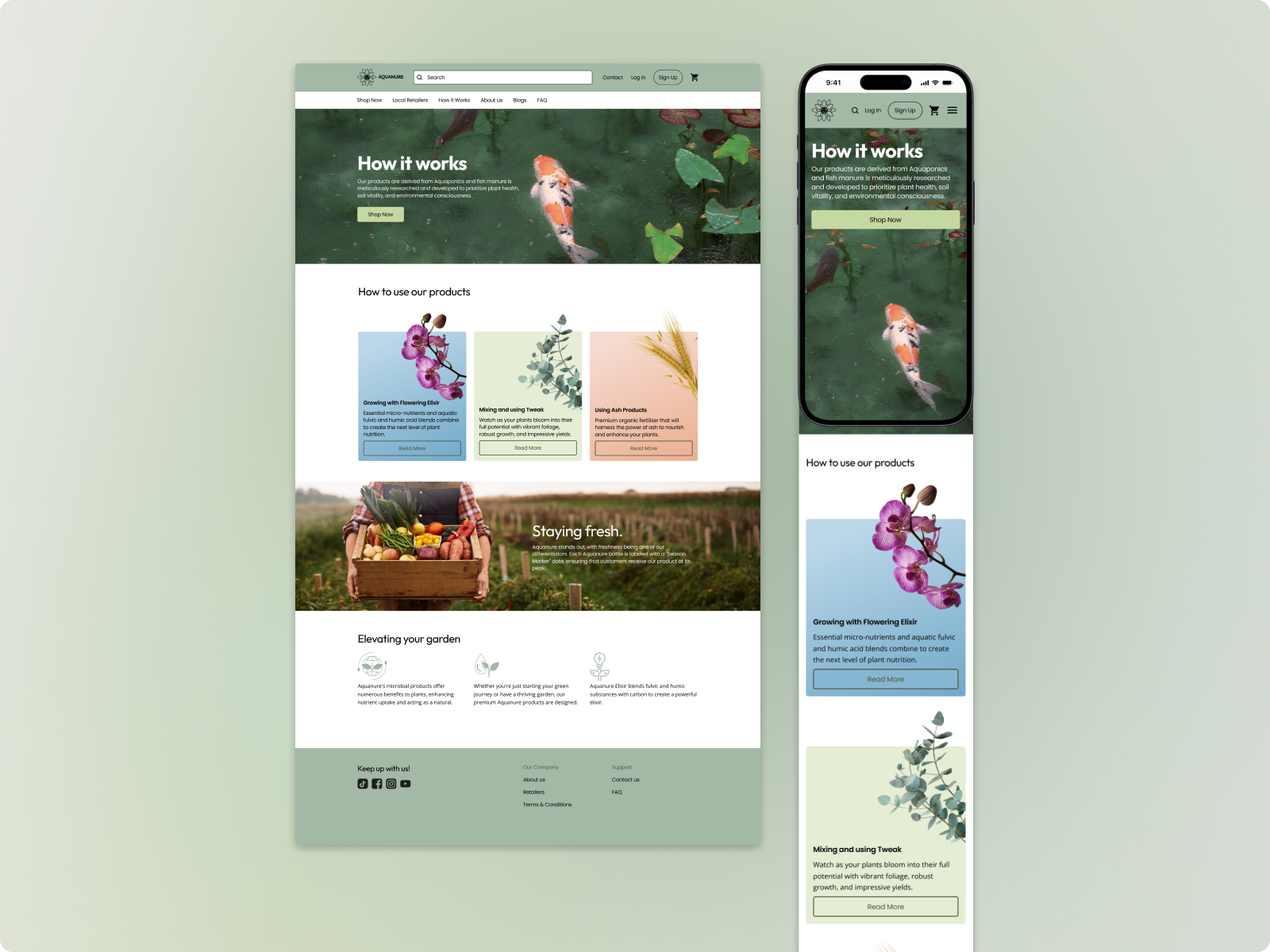
For the case of how to use the products, Christa can easily find all the information she needs on the “How it Works” page.
For the case of how to use the products, Christa can easily find all the information she needs on the “How it Works” page.
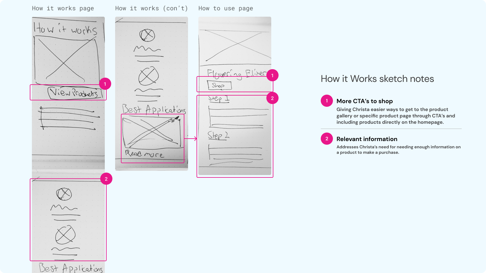
Sketches
Exploring Ideas on paper
Sketching let me explore more ideas based off of the task flow I designed as well as where I would place information and give Christa easier access to common actions.
I can address Christa’s need for a convenient and easy shopping experience by including more shop now CTA’s available as the first thing she see’s when she lands on the homepage.
I can address Christa’s need for a convenient and easy shopping experience by including more shop now CTA’s available as the first thing she see’s when she lands on the homepage.

By including testimonials and information about Aquanure products through the ‘How it Works’ page, I can also address Christa’s pain point of not having enough information on products to make a confident purchase.
Additionally, she can reach out to Aquanure through a contact form for more specific inquiries that may not be answered through the ‘How it Works’ and ‘FAQ’ pages.
Additionally, she can reach out to Aquanure through a contact form for more specific inquiries that may not be answered through the ‘How it Works’ and ‘FAQ’ pages.
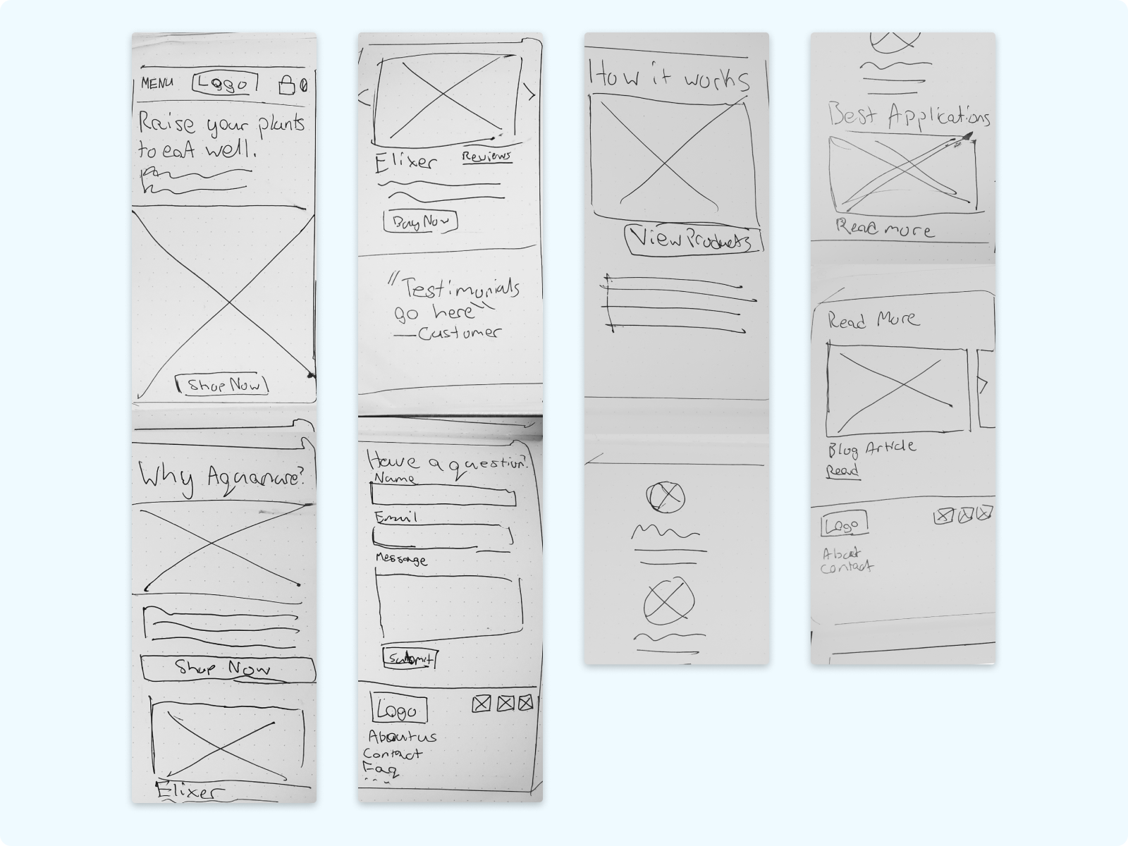

Mobile sketches


Desktop & Mobile lo-fi wireframes
User Testing Changes
Low & Mid Fidelity Changes
User tests were conducted with 8 plant enthusiasts and gardeners for the lo-fi and mid-fi wireframes which resulted in these core changes.
Clearer verbiage
The copy didn’t seem to communicate clearly what Aquanure products were made of or what they were used for. The copy was iterated to clearly communicate what all about the products without the use of excessive jargon.
Hero section copy changes
Before
Aquanure, a distinct organic growth elixir crafted by aquaponics farmers, harnesses the power of nature. Thriving on key elements derived from fish effluent, it creates exclusive blends of fulvic and humic acids, Dry Fine Ash, and Inoculated Bio-Char, providing an authentic solution for growers.
Aquanure, a distinct organic growth elixir crafted by aquaponics farmers, harnesses the power of nature. Thriving on key elements derived from fish effluent, it creates exclusive blends of fulvic and humic acids, Dry Fine Ash, and Inoculated Bio-Char, providing an authentic solution for growers.
After
Aquanure, a unique organic boost created by aquaponics farmers. Crafted from fish manure, it combines essential nutritional acids with BioChar, offering a fantastic solution for all types of growers!
Aquanure, a unique organic boost created by aquaponics farmers. Crafted from fish manure, it combines essential nutritional acids with BioChar, offering a fantastic solution for all types of growers!
- Excessive use of jargon and scientific terms.
-
Simplified terms, with specific ingredients moved to the product description.
- Targeting wider demographic of gardeners and plant growers.
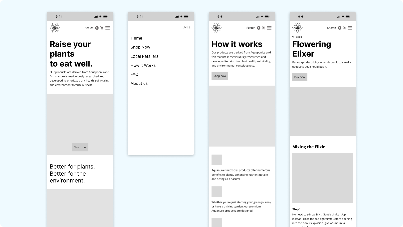
Easier way to find how to use the products
Users struggled to find information on how to use the products so the ‘Best Applications’ section that lead to pages on how to use each product was moved to the top of the ‘How it Works’ page.
The subtitle was also renamed from ‘Best Applications’ to ‘How to use our products’ to be more clear.
The subtitle was also renamed from ‘Best Applications’ to ‘How to use our products’ to be more clear.

Technical issues
Around this time is when I was tinkering with Wix Studio more, and learned that there wasn’t a ‘buy now’ button that would lead directly to the customers checkout.
I had been under the impression there was because of a Youtube tutorial that ended up being a complicated work around which messed with the checkout process.
I had been under the impression there was because of a Youtube tutorial that ended up being a complicated work around which messed with the checkout process.
Work around to give a faster way to shop
Instead, I iterated the flow to include an ‘add to cart’ button to directly bring customers into the checkout flow from the home page. This was ideal for returning customers who want a quick experience to order their usual products.
Additionally, I used Wix’s ‘quickview’ feature, so users can view information for a product and add it to their cart without having to leave the page.
Additionally, I used Wix’s ‘quickview’ feature, so users can view information for a product and add it to their cart without having to leave the page.
Visual design
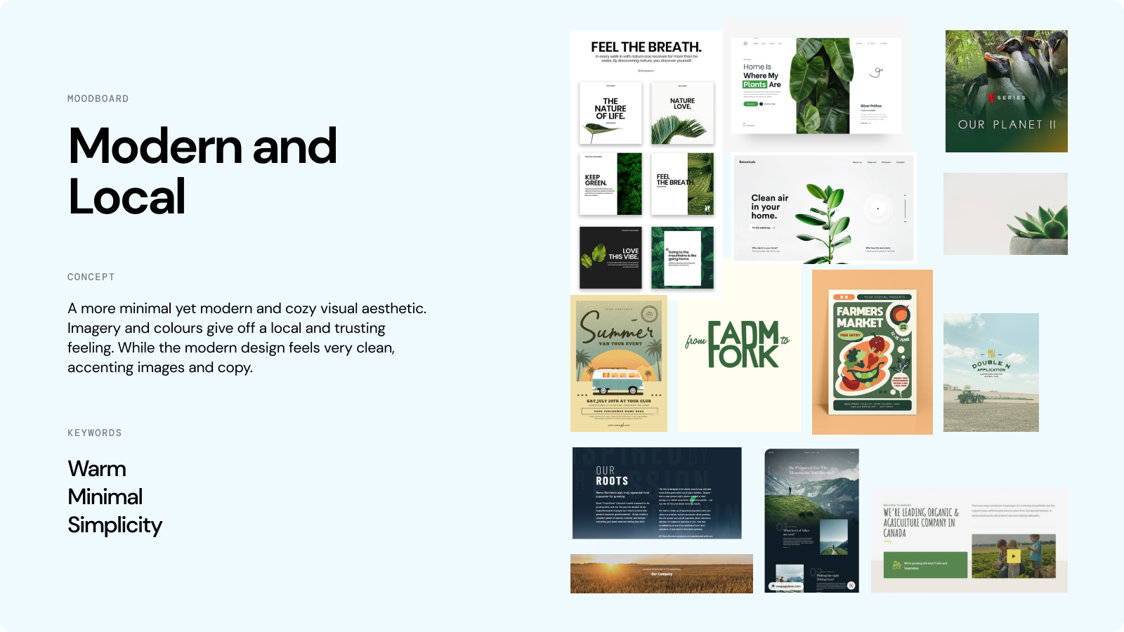
Modernizing Aquanure
I led a meeting with the stakeholder to discuss the visual design of the website and how it fits within Aquanure’s branding. I proposed three moodboards and we agreed on a modern and clean look that also felt local and warm.
Colour
We use a primary green here, reflecting a muted version of Aquanure’s green, which gives the feeling of being environmentally friendly, local, and warm.
Using the primary green was reserved to accent important sections and CTA’s, giving the website room to breath in whitespace which results in it feeling very open and welcoming.
This lets the imagery and products feel more important and impactful.
Using the primary green was reserved to accent important sections and CTA’s, giving the website room to breath in whitespace which results in it feeling very open and welcoming.
This lets the imagery and products feel more important and impactful.

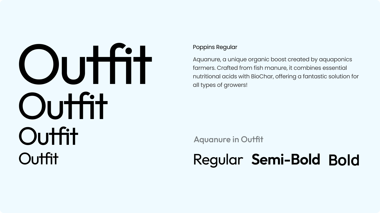
Typography
‘Outfit’ is Aquanure’s main typeface, used for heading and sub-headings. ‘Poppins’ is used for body copy which compliments the geometric shapes of Outfit, but is more suited for longer body copy.
Both typefaces are geometric and very soft/round, lending itself to that modern but local feeling.
Both typefaces are geometric and very soft/round, lending itself to that modern but local feeling.
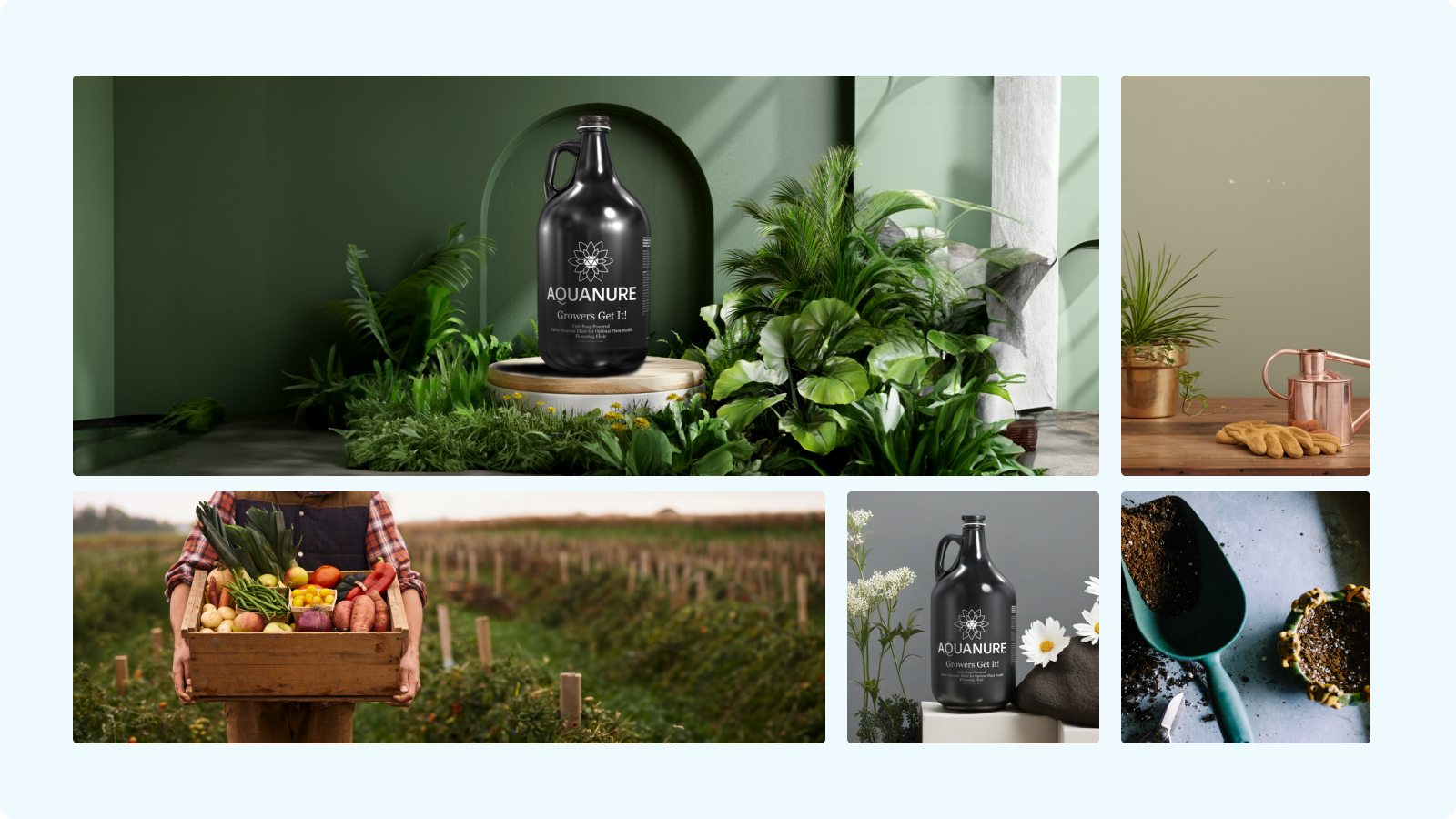
Imagery
The imagery reflects a very warm feeling, using images of vibrant plants and setting the products in vibrant spaces.
*Product images were bashed with generated imagery due to a short deadline and lack of resources, they are intended to be stand-ins until the stakeholders can get more suitable product shots.
*Product images were bashed with generated imagery due to a short deadline and lack of resources, they are intended to be stand-ins until the stakeholders can get more suitable product shots.
Final design
Raise your plants to eat well.


View the live website here.
What I learned
Meeting the user and stakeholder needs.
I learned a lot about how to lead meetings with the stakeholder and managing expectations.
I used this project as a great opportunity to ensure the stakeholder was always on the same page and addressing any concerns he had.
Working with website builders.
Using Wix Studio’s integrated e-commerce system taught me how to come up with solutions that could be used with limited technologies.
The final product will never look exactly like the prototype, but I’m glad our team came together and made the website live.
What I’d do better next time
Familiarize myself with the platform I’ll be implementing the design on before I design.
Several roadblocks came up with using Wix Studio, feeling like I was limited in what I can design or what features we could implement but couldn’t.
Doing research to familiarize myself with what was possible and what would be difficult or cost more money would help me come up with solutions earlier in the process.
Next Project