Giving teens and young adults a starting point for their investing goals.
Role
UI/UX Designer
Timeline
5 Months
Team
UI/UX Designer
UX Researchers
Tools
Figma, Figjam, Miro, Google Forms, Slack
Boosting Confidence
Users reported that the app would boost their confidence and encourage them to stay on track.
Giving an easy starting point
Users reported that the app made setting an investment goal easy.
Overview
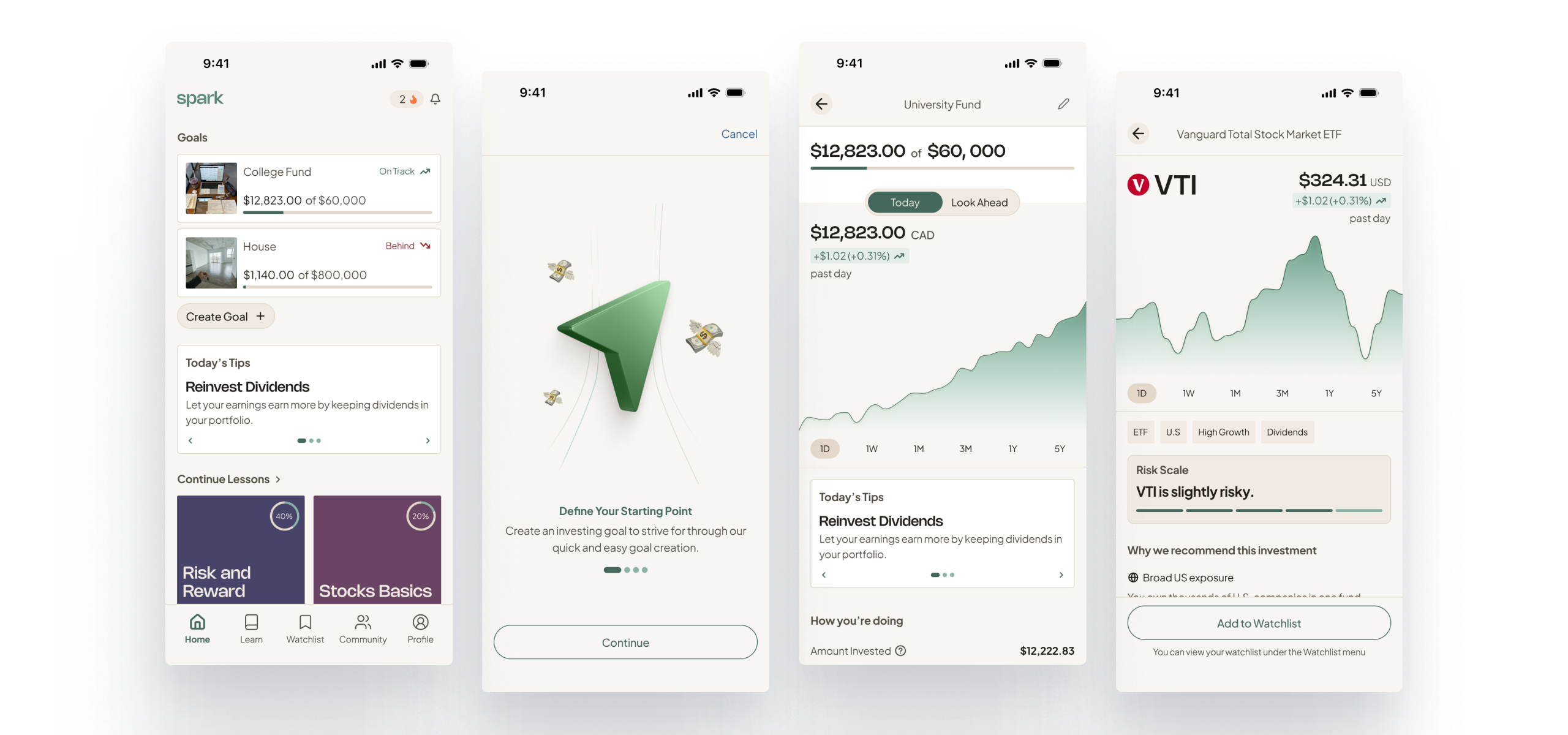
Spark is a goal oriented investing app which gives teens and young adults the confidence, knowledge, and guidance to meet their investing goals. The goal tracking feature gives users a starting point in their investing journey and helps keep them on track.
This is a self-initiated project built off of what was originally a group project. This app takes a different direction than what was originally created but builds off of it’s original foundation.
Financial literacy is a lot.
Is the general sentiment that’s held among my peers and myself. This launched a curiosity during a group project which led us down the road to learn more about why so many young people struggle with financial literacy, and more specifically investing.
Teens and young adults are so overwhelmed by the amount of information on investing that they don’t know how to start.
I helped conduct user research which revealed that participants were intimidated to start investing due to their lack of knowledge.
Insight 01
Young people are scared and confused when it comes to investing
Insight 02
Learning investing (financial literacy in general) is a continual process
Insight 03
It’s crucial to teach young people how to invest in order to achieve long-term financial success
How might we...
…create an engaging and interactive app that empowers teenagers and young adults to confidently learn, invest, and build strong financial foundations?
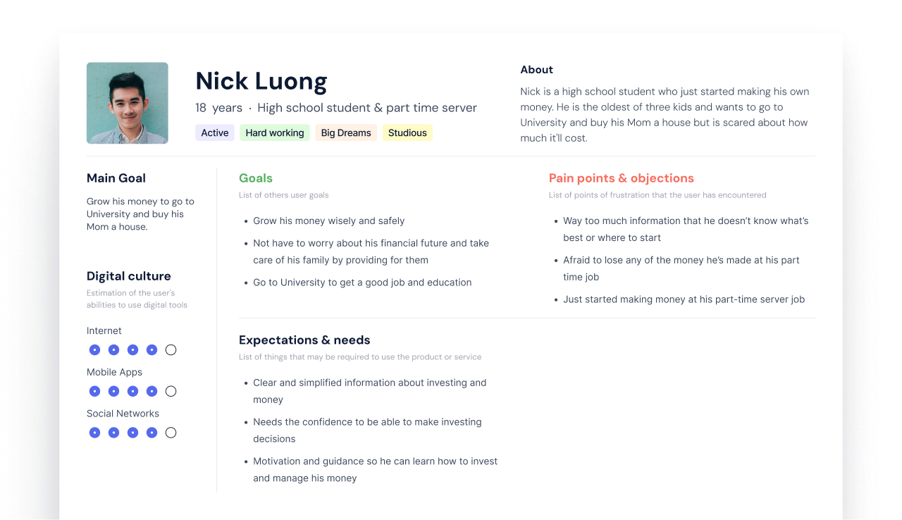
I created a persona named Nick made of all the fears and frustrations a teenager has when starting to think about investing.
Finding a way to provide guidance and direction for new investors.
A competitor analysis found that while there were competitors aimed at being vehicles to help new investors to learn to invest, there weren’t any that actually gave users like Nick a starting point.
Explorations 01
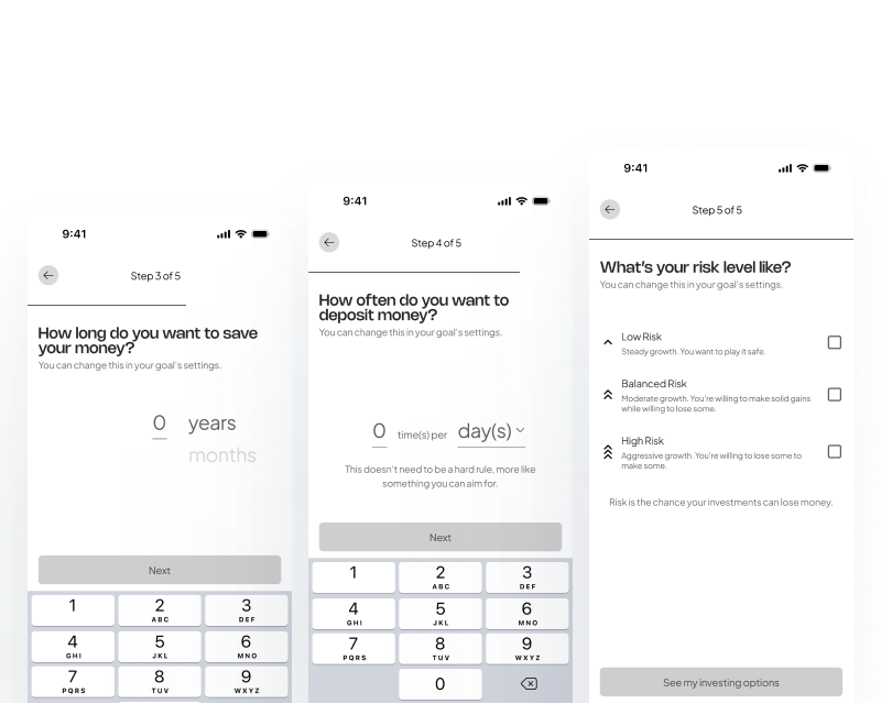
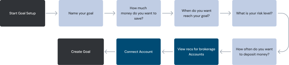
Creating an investing goal
I began exploring ways to give Nick a starting point and something to work towards, which led to the idea of a goal tracker.
Setting up a goal for the users needs
The goal setup helps the user create their own starting point according to their own risk levels, how much they want to invest, and how often they want to invest.
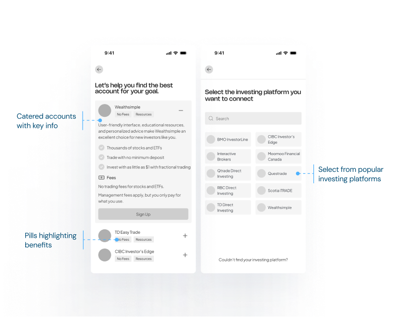
Connecting an investment account
Goal creation gives the user brokerage accounts suited for their needs or lets them connect their own account.
Simplified early iteration for create goal flow
Explorations 02
Giving Investment Recommendations
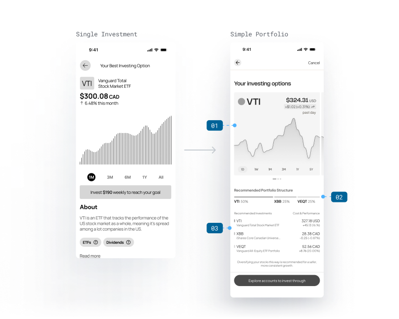
While giving suggestions for investing accounts is useful, users would still have to research assets to invest in – so I explored ways to suggest investments like ETFs or stocks that would suit the users needs.
What’s enough to get Nick started?
Early explorations that recommended one investment wasn’t enough to get Nick started, so I also explored a simple portfolio.
01
Performance chart carousel for all recommended investments.
02
Portfolio structure visualized. The portfolio is simple and easy to manage for beginners.
03
List of investments limited to 3 to not overwhelm the user.
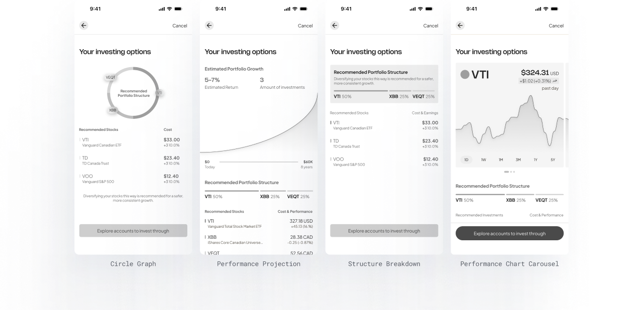
Explorations for portfolio recommendations
Variations focused on displaying the portfolio structure and important details with clarity.
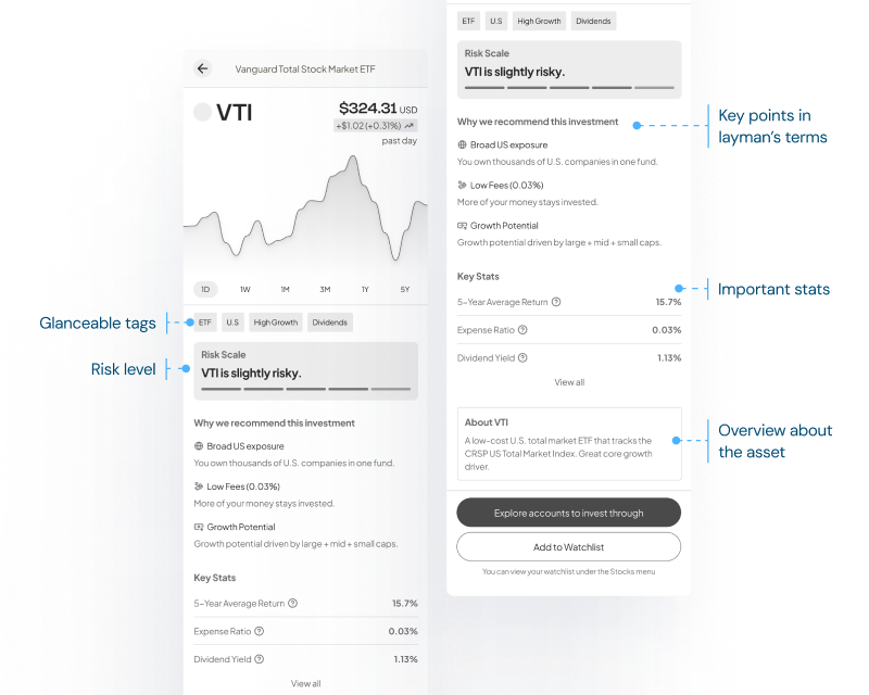
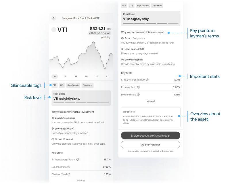
Investment Asset Page
Explanation as to why this asset is suggested, along with key information.
Glanceable information relevant to user’s needs.
Language and terms simplified for beginners.
Explorations 03
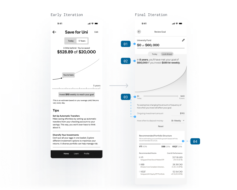
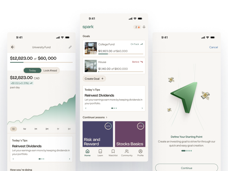
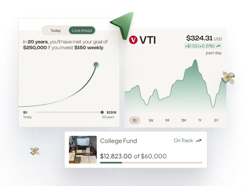
The Goal Tracker & Look Ahead Graph
Users are able to track the progress of their goal and are given tips to help stay on top of it. I also explored ways to ‘look ahead’ which is a projection of where their money will be in the future – this gives users a sense of progress and motivation.
Creating a goal tracker that will help users meet their goals.
01
Better progress indicators like progress bar and highlighting how the user is doing.
02
Shorter, scannable copy in layman’s terms.
03
Breakdown and performance of the user’s current portfolio.
Helping users stay on track and build motivation.
01
Progress bar visible on both ‘Today’ and ‘Look Ahead’ tabs.
02
Summary of what is needed to reach the user’s goal.
03
User tests found that users wanted to manipulate the graph in real time. This helps users understand how investing today impacts what they’ll have in the future.
04
User is able to refer to the recommended portfolio structure.
Final Designs
Start investing and grow money towards your goal.
Reflection
Go back to your core principles.
Establishing core design principles has helped my workflow stay focused and always moving in the right direction. I learned how to make faster, informed decisions by always referring back to the principles.
Always refer back to the user.
Nick’s persona was a central point for this project and being in his shoes helped me discover pain points and use case scenarios. Having a strong, fleshed out persona was essential for creating strong solutions.
Creating impact with the least complexity.
My time working on this project taught me how to design solutions that created the most impact with the least complexity. It’s easy to geat caught up in scope creep but focusing on strong solutions that solve common pain points was something I learned was important.